.png)


Premium Packaging for Startups: How to Look Like a Category Leader Without a Category Leader's Budget
Premium packaging for startups means designing product packaging that signals quality, earns trust, and drives purchase: without a category leader's budget. For Indian D2C founders, it means your packaging must sell on a BigBasket shelf, convert in a Blinkit thumbnail, and make a retail buyer take you seriously in a pitch meeting. This guide breaks down exactly how to get there.
Why Your Packaging Is Your First Salesperson
Your product may be excellent. Your Instagram may look sharp. But if the packaging doesn't communicate value in the first few seconds, shoppers walk past it.
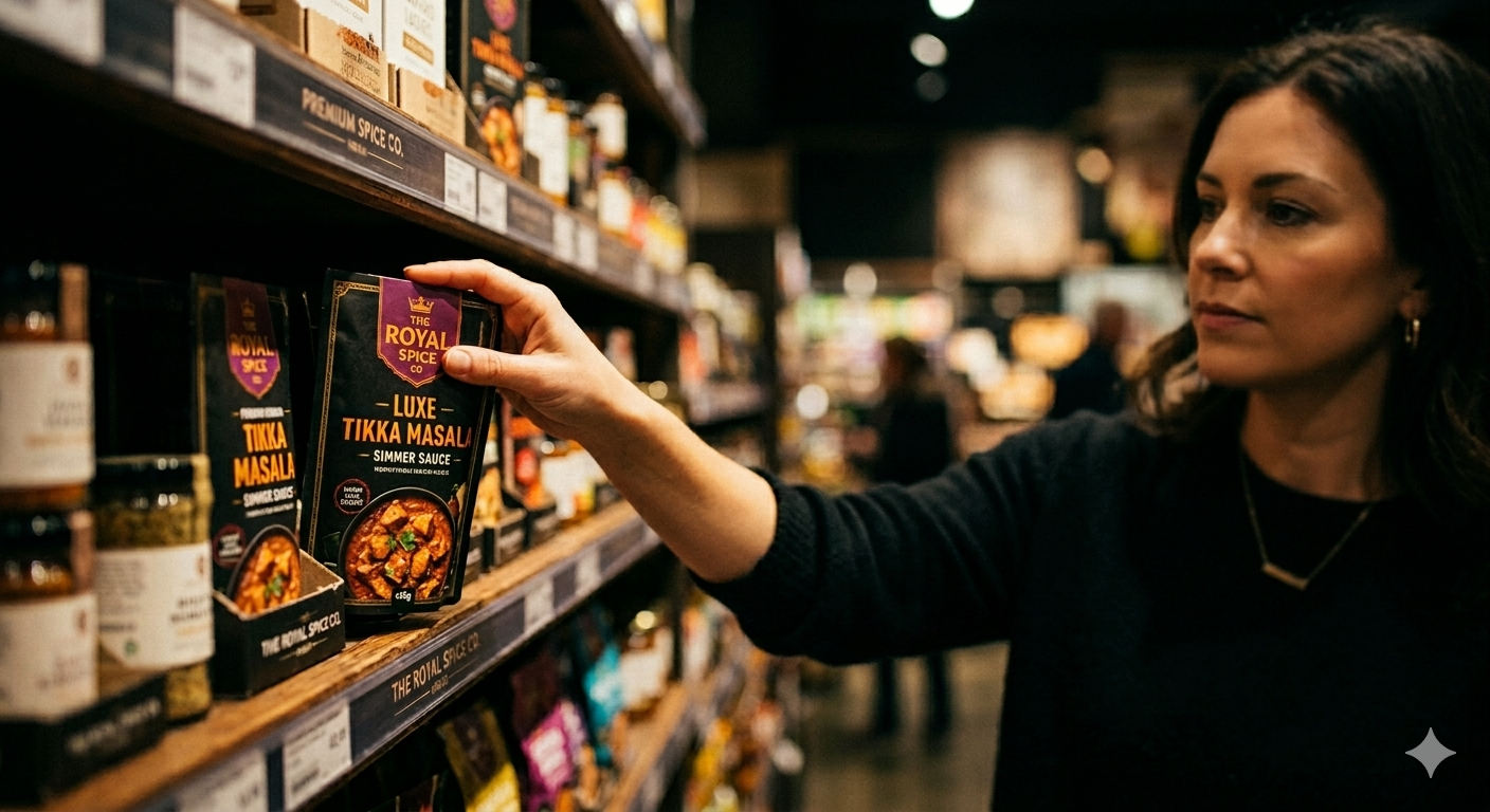
Retail buyers in modern trade make stocking decisions based heavily on how packaging looks and how clearly the brand story comes through. The packaging creates the first impression, signals the price point before anything is read, and gives retail buyers the confidence to take a chance on a brand they've never stocked before.
Packaging isn't decoration. It's commercial infrastructure.
Step 1: Lock Brand Clarity Before You Brief Anyone
Before you choose a material or open a design brief, you need clear answers to three questions:
- What does your brand stand for? (One sentence. No vague language.)
- Who is your exact buyer? (Age, life stage, primary purchase channel.)
- What category signals do you want to own vs. deliberately break?
Most startup founders skip this and go straight to "make it look premium." The result is a beautiful box that could belong to any brand in the category.
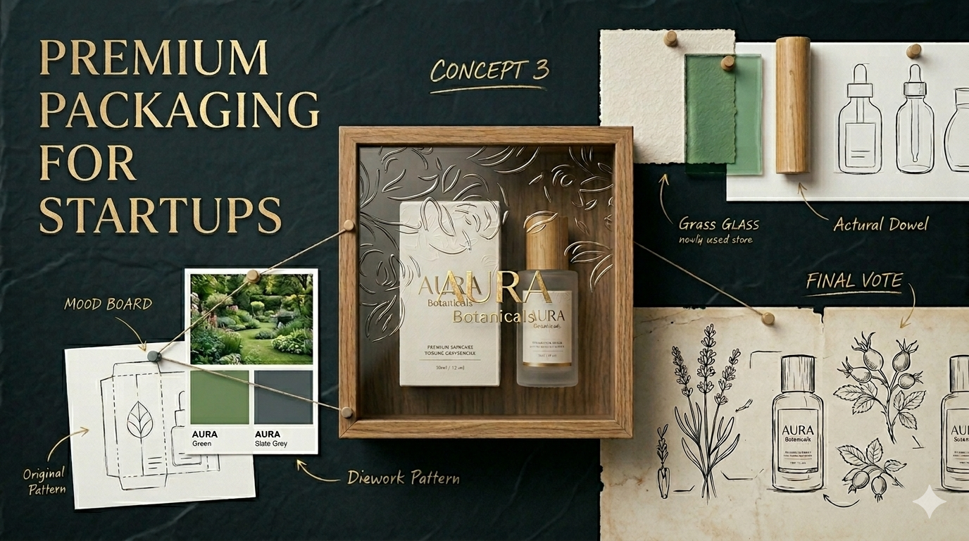
The Whole Truth is instructive here. Their packaging looks nothing like any other nutrition bar on the Indian market because the design was built on a specific belief: radical transparency. Every ingredient is listed in plain English on the front. No fine print. No lifestyle photography. No marketing language. That belief shaped every packaging choice: typography, colour, layout, finish. The result is packaging that is instantly recognisable and unmistakably theirs.
Good packaging starts with strategic clarity, not design execution.
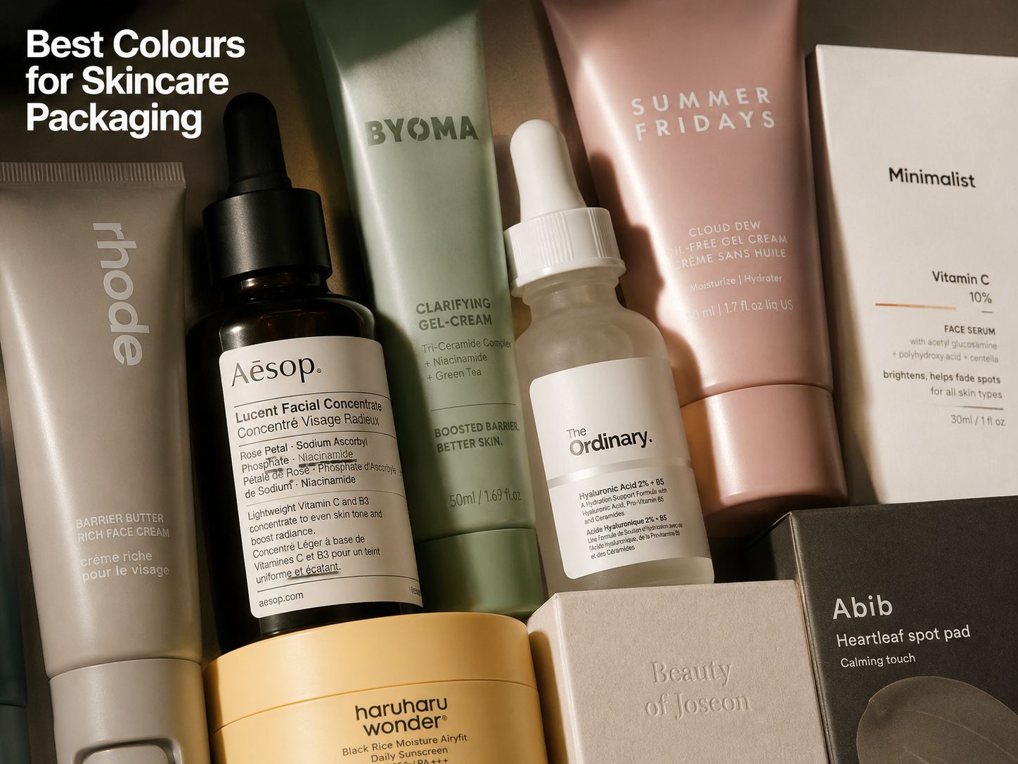
Step 2: Choose Materials That Communicate the Right Price Point
The weight and feel of your packaging signals price before the shopper reads a single word.
Most startups can achieve a premium look with a folding carton and strong design. A rigid box is not mandatory.
What to specify for a premium startup pack:
- Paper weight: 350–450 GSM minimum. Below 350 GSM, the box feels thin and undermines the product inside, regardless of design quality.
- Surface finish: Soft-touch matte coating is the most accessible premium finish available in India. It feels expensive, photographs well, and holds print colour correctly.
- Box structure: Rigid boxes signal luxury and are used by most premium skincare and supplement brands. Folding cartons are more cost-efficient and perfectly premium when the paper weight and finish are right.
- Sustainable materials: Kraft and recycled board read as considered and intentional, not cheap. Slurrp Farm built its premium-for-parents positioning on exactly this: warm kraft, hand-drawn illustration, and a colour palette that communicated safe and thoughtful rather than clinical. The material choice was a brand signal, not a cost-cutting decision.
Request physical samples before committing to a print run. Approve all material choices in hand, not on screen.
Step 3: Design for Three Viewing Distances, Not One
A well-designed pack must work at three viewing distances:
Most startup packaging fails at the first level. Founders focus on the in-hand experience and underinvest in shelf visibility.
MCaffeine solves this well. Their packs are high-contrast, use a bold single key ingredient as the hero, and the brand name reads from distance. Every product in the range tells the same story in the same visual language. That consistency is a system, not an accident.
For your front-of-pack layout, map elements in this order:
- Brand name (largest, always)
- Category identifier (what is this product?)
- Primary claim or differentiator (why choose this?)
- Supporting detail (quantity, certifications, key ingredients)
Nothing else belongs on the front face at launch.
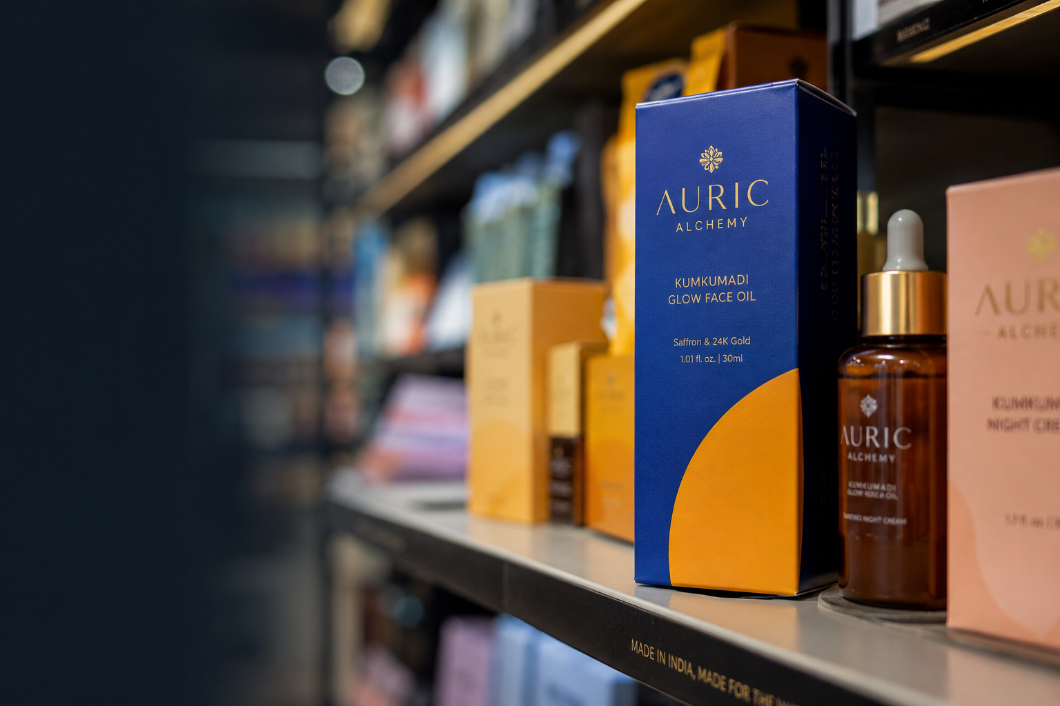
Step 4: Use One Premium Finish, Not Five Average Ones
Print finishes are where startup packaging budgets get wasted fastest.
A common mistake: adding foil stamping, spot UV, embossing, matte coating, and a gloss accent to a single box because each individual sample looked impressive. The combined result reads as cluttered, not premium.
Spend on one well-placed finish. Keep everything else restrained.
If your budget only allows one premium enhancement, choose soft-touch matte or foil: not both.
What works:
- Hot foil stamping on the logo only: Adds a luxury feel without visual noise. The contrast between the matte surface and the metallic logo is enough.
- Soft-touch matte coating as the base finish: Immediately improves how the pack feels, at low additional cost over standard coating.
- Debossing on a brand mark or pattern element: Subtle, tactile, and memorable without drawing attention away from the brand name.
- Spot UV as a selective accent: Works cleanly on a single design element: a logo, a border, a graphic device. Not scattered across the face.
For startups printing under 1,000 units, digital printing removes the need for costly setup. Test in digital print first. Move to offset with finishes when volumes justify it.
Step 5: Brief Your Designer Like a Business, Not a Creative
A poor packaging brief produces revision cycles that delay launch. A complete brief must include:
- Brand guidelines: final colours, fonts, logo files in vector format
- Confirmed structural template from your printer: never brief a designer without it
- Layout notes for each packaging face (front, back, sides)
- FSSAI mandatory declarations if you're in food, beverage, or supplements
- Required copy: net weight, MRP, manufacturing and expiry format, batch number location, customer care details
- Competitor reference packs: 3–5 you admire, 3–5 you want to look distinctly different from
- Your priority finish within budget
- Shelf specifications if you are preparing for modern trade entry
If you need a studio that understands what retail-ready packaging requires for Indian D2C brands: from FSSAI compliance to quick-commerce thumbnail testing: Jellypop's packaging design for D2C brands covers end-to-end execution from brief to print-ready files.
Step 6: Test for Quick Commerce Before You Approve Final Artwork
Quick commerce (Blinkit, Zepto, Swiggy Instamart) is now a primary D2C discovery channel in Indian metros. Your product will appear in a listing thumbnail at roughly 150 x 150 pixels on a mobile screen.
At that scale, most startup packaging becomes an unreadable blur. The brand name disappears. The colour reads as grey. The product claim is invisible.
If the product name cannot be read in 2 seconds at thumbnail size, redesign before printing.
Before you approve final artwork:
- Screenshot the product category page on Blinkit or Zepto
- Resize your pack artwork to 150 pixels wide
- Place it beside six competitors at actual listing size
- If the brand name and primary colour block are clear and distinct, the design works
- If it disappears, adjust the layout or colour contrast before going to print
This takes 10 minutes. Missing this step means reprinting at full cost after launch.
The Pre-Print Checklist for Startup Packaging
Design
- Brand identity finalised: colours, fonts, logo in correct format
- Artwork reviewed at full print scale, not on screen only
- Bleed, crop marks, and safe zones set correctly
- Thumbnail test completed at 150 pixels for quick commerce
Compliance
- FSSAI mandatory declarations included and reviewed
- Barcode generated and tested for scan accuracy
Production
- Structural template confirmed from printer
- Physical prototype built and approved before print sign-off
- Material samples approved in hand
Final Approval
- Final artwork approved by one senior decision-maker who has seen the physical prototype
Common Mistakes That Make Startup Packaging Look Amateur
- Designing without a confirmed structural template: Artwork that doesn't match the actual box structure requires a full redesign after the first prototype is built.
- Five finishes instead of one: Overcrowding finishes signals indecision, not luxury. The pack reads as cluttered rather than premium.
- Skipping the physical sample step: Colour and material feel shift dramatically from screen to print. Unexpected issues only appear in hand.
- FSSAI copy as an afterthought: Mandatory declarations forced into small corners after design is complete break the layout and create compliance risk.
- No quick-commerce thumbnail test: Packaging designed only for in-hand view fails at Blinkit and Zepto listing scale, where the brand name becomes invisible
If you'd like support figuring out where to start, Jellypop designs branding and packaging for Indian D2C founders, built for shelf, quick commerce, and digital from day one. Start a conversation at jellypop.design.