.png)


How Colour Impacts Positioning, Perception, and Sales in Skincare Packaging
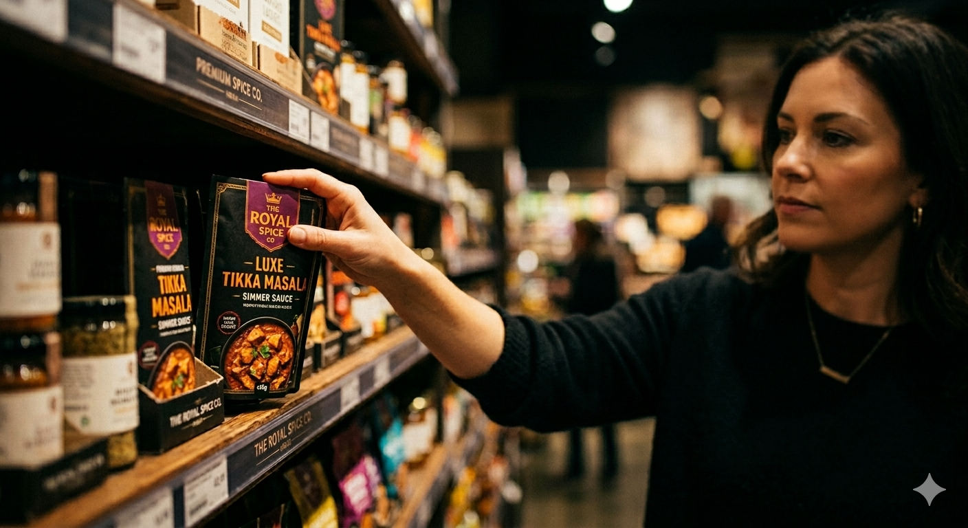
Most skincare founders find out their packaging isn't working in one of three ways. The product sits on a shelf next to five competitors and doesn't get picked up. The packaging looks fine in person but doesn't justify the price once a customer compares it to similar products. Or it performs well in person but disappears completely as a small thumbnail on Blinkit or Zepto, where most of today's shopping actually happens.
In all three cases, the root cause is often the same: colour.
A shopper scanning a BigBasket listing at 11 PM, a retail buyer walking a D-Mart aisle, a Blinkit customer scrolling in under 8 seconds: all three form their first impression based on colour, before they read the brand name, the ingredient list, or the price.
For Indian D2C skincare brands, this makes colour a business decision, not just a design one. The wrong colour can place a product in the wrong category in a shopper's mind before a single word is read. The right colour can support the price point, build trust in the formula, and help the product stand out on shelf and on screen.
This article looks at how colour affects positioning and perception, which colours are commonly used for which purposes in Indian D2C skincare, and how to choose a colour system that works across shelf, screen, and quick commerce in 2026.
Why Colour Is a Business Decision, Not Just a Design Choice
Colour in skincare packaging tends to do a few jobs at once:
Category signalling. Colour gives the shopper a quick read on what kind of product they're looking at: clinical, natural, luxury, or mass-market.
Price perception. Certain colour combinations are commonly associated with premium or mass-market positioning, often before the price is even visible.
Trust in the formula. Certain colours have built associations with certain ingredient categories over years of packaging convention. White is often linked with purity. Green is often linked with natural origin. Black is often linked with potency or luxury.
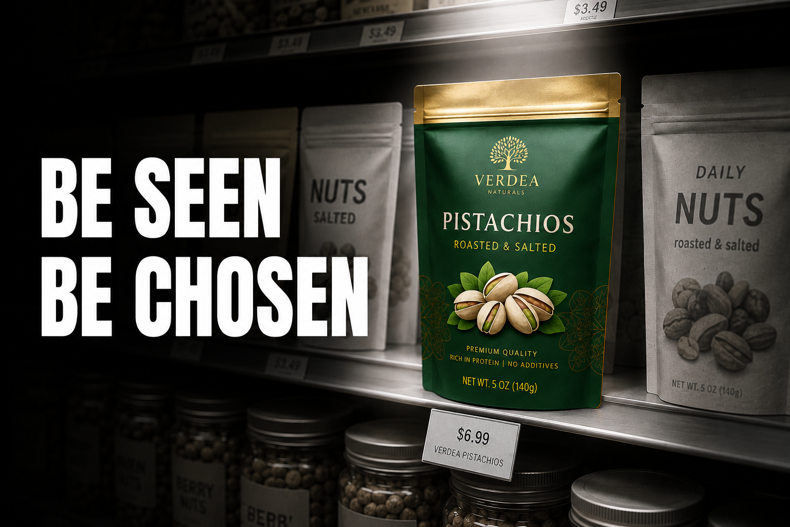
Differentiation on shelf and on screen. In a category aisle or on a Nykaa listing page, colour is usually the fastest way to stand out. A brand that owns a distinct colour territory tends to be the one shoppers notice first.
Get the colour wrong, and an INR 800 serum can end up looking like a INR 299 product. Get it right, and a INR 299 face wash can earn the shelf presence of something priced much higher.
Choose Colour Based on Positioning, Not Preference
Before looking at individual colours, it helps to start from positioning rather than personal taste. The table below maps common positioning goals to colour territories that are frequently used to support them.
This is a starting point, not a rulebook. The right choice still depends on what your competitors are doing and how your packaging will be seen: in person, on a shelf, or as a small image on a delivery app. The sections below go into each colour territory in more depth.
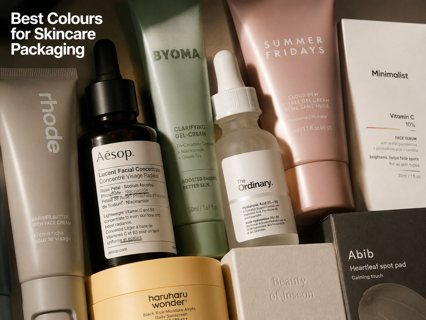
Colour Territories in Indian D2C Skincare
White and Off-White: The Clinical Default
White is one of the most commonly used base colours in skincare packaging, largely because it suggests that nothing is being hidden. Off-white and cream variations soften this clinical feel and add warmth, which works well for natural and Ayurvedic positioning.
Mini case study: Minimalist. Minimalist built its entire visual identity around white. The choice wasn't decorative: it directly supports the brand's core promise. By printing ingredient percentages in bold black type against a plain white label, the packaging makes the formula itself the hero, which helps the brand feel closer to a pharmacy product than a cosmetic one. This works particularly well for a brand whose entire pitch is "no unnecessary ingredients, just what works." Their off-white and cream variants for ceramide and retinol lines keep this clinical positioning while feeling slightly gentler for sensitive-skin buyers.
White works well with minimal typography, single-weight serif or thin sans-serif fonts, and soft-touch matte lamination. One risk: white packaging with standard gloss lamination can look inexpensive on shelf, especially for products priced above INR 400.
Sage Green and Muted Olive: Natural Without the Mass-Market Look
Sage and muted olive have largely replaced bright green as the go-to "natural" signal in premium Indian skincare. Bright green is now closely associated with mass-market and general-trade herbal products, so brands aiming for a more upmarket natural positioning tend to move toward these quieter greens.
Mini case study: Plum Goodness. Plum uses muted green as a core identifier across its vegan skincare range. Rather than relying on a "vegan certified" badge or explanatory copy, the colour itself communicates plant-based positioning at a glance: the copy then simply confirms what the colour has already suggested. This is a useful approach for brands whose key differentiator is an ingredient philosophy rather than a specific active ingredient.
Sage green pairs well with kraft paper labels, recycled card secondary packaging, and warm serif or humanist sans-serif type. One risk: sage green is a quiet colour, and without strong typographic contrast it can lose visibility on a small Blinkit thumbnail.
Black and Deep Charcoal: The Fast Track to Premium
Black packaging tends to raise perceived price more quickly than almost any other colour choice in skincare. Deep charcoal: a slightly softened black: keeps much of this premium feel while reducing the starkness of pure black.
Mini case study: MCaffeine. MCaffeine's charcoal-based line uses dark packaging to support its "deep clean, high concentration" story. Against the dark background, the charcoal graphic becomes the visual focus without competing with text. This lets the packaging read as premium even at a INR 299 price point: which is a real challenge for a brand at that price tier, where packaging often has to do more work to justify the cost.
Black works well with metallic typography (gold, silver, copper), minimal label information, matte or velvet-touch lamination, and glass or aluminium packaging. One risk: black with too much white text can end up looking clinical and high-contrast rather than premium: the balance between information and empty space matters here.
See our guide to what makes packaging look luxurious for a breakdown of the specific colour, finish, and material decisions, beyond just black, that create a luxury perception at each Indian D2C price tier.
Dusty Pink and Blush: Hydration With a Soft Edge
Dusty pink and blush tones are increasingly used in Indian skincare packaging, particularly for hydration-focused and sensitive-skin products. These muted, grey-toned pinks suggest gentleness and a sense of ritual, without feeling aggressive.
Mini case study: Nykaa's private label. Nykaa's own-brand skincare line uses blush and dusty rose across its moisturising and hydration range to support a sense of femininity and self-care. This palette helps position Nykaa's own-brand products as a premium-feeling alternative to imported hydration brands: without needing a higher price point to support that perception. The colour does some of the positioning work that price alone might otherwise have to do.
Dusty pink works well with white or ivory typography, soft serif fonts, curved label shapes, and frosted or translucent packaging. One important distinction: bright or hot pink tends to read as juvenile or promotional in skincare, while a muted, grey-toned pink reads as premium. The difference between the two is the difference between a premium shelf position and a discount-bin one.
Pale Blue and Ice Blue: An Underused Opportunity
Pale and ice blue are commonly associated with water, hydration, and science-backed formulas: making them a natural fit for toners, light serums, and SPF-adjacent products. In Indian skincare specifically, blue remains underused, which means a brand that claims this colour territory may find a genuine point of difference in a category dominated by white and green.
Mini case study: Pilgrim. Pilgrim's Korean-inspired range uses cool, pale blue tones for its hydration and barrier-repair products. The colour reinforces the brand's "Korean beauty science" positioning: clinical, water-based, lightweight: and stands out in a shelf where most Indian skincare brands default to white or green. The blue alone gives Pilgrim a visual signature before a shopper reads anything else.
Pale blue works well with clean sans-serif typography, white secondary packaging, and minimal graphic elements. One thing to watch: blue carries a strong association with men's grooming products in India and globally. Female-first skincare brands may want to adjust the tone: adding warmth or going lighter: to avoid sending the wrong signal.
Warm Beige and Terracotta: The India-Rooted Premium Look
Beige and terracotta are increasingly used as a premium signal for India-rooted skincare: brands that lead with ingredient heritage (turmeric, saffron, sandalwood, multani mitti) rather than scientific-sounding names. Terracotta in particular has gained ground in 2025-26, as brands move away from the more generic "Ayurvedic green" look toward something more refined.
Mini case study: Forest Essentials. Forest Essentials built its entire brand language around warm beige, gold, and terracotta: deliberately avoiding the saffron yellow and traditional motifs many Ayurvedic brands default to. The result is packaging that can sit comfortably next to international luxury skincare on a shelf, communicating heritage and quality before any ingredient story is read.
Beige and terracotta work well with gold foil accents, textured kraft or cotton paper labels, hand-drawn botanical illustrations, and warm serif or calligraphic typefaces. One risk: without strong typography and a clear layout, these tones can start to look like generic small-batch craft packaging rather than a considered premium product.
Deep Purple and Aubergine: Signalling Active Ingredients
Deep purple and aubergine are often associated with anti-ageing formulas and high-potency actives such as retinol, peptides, and collagen-supporting ingredients: an association that's increasingly visible in Indian D2C as well. For brands building a retinol or peptide line, purple can help position the product within a higher-efficacy, science-forward colour territory.
Mini case study: Wellbeing Nutrition. Wellbeing Nutrition's active skincare and supplement range uses deep, violet-adjacent tones to suggest scientific credibility and potency: without needing clinical photography or dense copy to make the point. The colour itself does much of the work of establishing the product's positioning before the ingredient story is read.
Deep purple works well with metallic or holographic typography, dark secondary packaging, and premium finishes such as glass or aluminium closures. One important distinction: lighter purples (lavender) tend to read as scented mass-market body care rather than active skincare. The difference between a deep, rich purple and a pale lavender is a positioning choice, not just a shade preference.
A Good Colour Can Still Fail
Choosing one of the colours above doesn't guarantee it will work: because colour effectiveness depends heavily on what's already on the shelf.
If every competitor in your category already uses sage green, adding another sage green product won't make you stand out: it will simply blend in with the rest. The same applies to white: in a category where white is already the default, another white pack loses its differentiating power, however well-designed it is.
This is the part of colour strategy that's easy to miss. A colour that performs well in isolation can perform poorly in context, simply because someone else got there first. The goal isn't to pick the most attractive colour: it's to pick a colour that fits your positioning and is still available as a point of difference in your specific shelf or category.
Before finalising a colour, it's worth asking:
- What is the dominant ingredient story? Natural or botanical origins tend to point toward green, beige, or terracotta. Science-led actives tend to point toward white, black, or purple. Hydration and barrier repair tend to point toward blue or pink.
- What does your price tier need from colour? At INR 200–INR 400, you're competing for attention in a high-noise environment. At INR 600–INR 1,500, the colour needs to suggest the price is justified without further explanation.
- Who is the primary buyer, and what colours do they associate with trust? A younger, acne-focused buyer may read blue and white as clinical and credible. A buyer over 35 looking for anti-ageing results may read black and deep purple as signs of potency. A natural-beauty buyer may read sage green and beige as aligned with their values.
- What colour does your closest competitor already own? If the two most visible products in your category are white and green, a product that arrives in black or blue is likely to stand out simply by being different: before a shopper reads a word.
Colour and Quick Commerce: The Thumbnail Test
Every packaging colour choice now has to pass what's sometimes called the thumbnail test. On Blinkit, Zepto, and Instamart, products typically appear as small images: often around 80–100 pixels. On Amazon and Nykaa listing pages, thumbnails are only slightly larger. At that size, colour either holds up or it doesn't.
White generally needs strong typographic contrast and a clear brand-colour accent to stay legible at small sizes: plain white-on-white tends to disappear.
Black tends to hold its presence at thumbnail size, especially with metallic or contrasting type, because the dark base creates contrast against most app backgrounds.
Pastels: blush, pale blue, sage: are the most at risk at small sizes. They can blend into the background of an app and lose their distinctiveness. A strong colour block or clear typographic anchor can help offset this.
Saturated, ownable colours: a deep terracotta, a rich purple, MCaffeine's bright accent tones: tend to perform well at thumbnail size, because the colour itself becomes the recognisable element, even before the product name is legible.
A practical way to check this: if your packaging colour disappears when shrunk to roughly 100x100 pixels, it likely isn't strong enough to stand out in quick commerce. The fix is usually one of three things: deepen the tone, add a dominant colour block, or increase the contrast between the colour and the typography. It's far easier to fix this at the design stage than after the packaging has gone to print.
See our guide to how packaging impacts ecommerce conversions for the full thumbnail audit framework, and what passing or failing the thumbnail test means specifically for click-through rate on Blinkit, Zepto, and Amazon India.
Materials Change How Colour Reads
Colour doesn't work in isolation: the material and finish it sits on changes how it's perceived, sometimes significantly.
Matte vs gloss. A matte black bottle and a glossy black bottle send different signals, even though the underlying colour is identical. Matte and soft-touch finishes tend to read as more premium, while gloss finishes on the same colour can feel less expensive: particularly above the INR 500 price point.
Frosted and transparent packaging. White printed on a frosted glass bottle reads differently from white printed on plastic. Frosted surfaces tend to soften colour and add a sense of quality; plain plastic can flatten the same colour and make it feel more utilitarian.
Metallic foils. Gold, silver, or rose-gold foil on a black or white base is one of the more reliable ways to push packaging toward a luxury feel, without changing the base colour at all.
Soft-touch coatings. A soft-touch coating on any colour tends to add a tactile sense of quality that a standard finish doesn't: which is part of why it's so commonly used on premium black and white packaging.
The takeaway is that a colour choice and a material choice are really one decision, not two. The same Pantone colour can look premium or ordinary depending on what it's printed on.
See our guide to best packaging materials for premium brands for a full breakdown of how finish choices across matte, soft-touch, spot UV, and foil interact with colour to determine final shelf perception.
Building Colour Into a Brand System
Choosing a packaging colour for one product is a different exercise from building a colour system for a brand. A single colour decision, made SKU by SKU, tends to drift over time: by the time a brand has seven or eight products, the first and the last can end up looking like they belong to different brands entirely.
A proper colour system documents:
- The exact Pantone code, for print production
- HEX and RGB codes, for digital use
- CMYK breakdown, for offset printing
- Approved surfaces for the colour: label, box, mailer, digital listing
- Approved combinations with the brand's secondary palette
- Restricted uses: what the colour should not be placed on or paired with
Without this kind of documentation, every new product launch becomes its own colour-matching exercise, and small inconsistencies accumulate across the range. A defined specification: not just a reference swatch: is what keeps a growing product line looking like one brand.
Colour Alone Will Not Save Weak Packaging
It's worth being clear about what colour can and can't do. Colour can help a product get noticed, support a price point, and signal the right category: but it can't compensate for packaging that's weak in other areas.
Typography that's hard to read, a layout with no clear hierarchy, a structure that doesn't hold up physically, materials that don't match the positioning, messaging that contradicts the colour story, or an overall packaging architecture that feels disorganised: none of these problems can be fixed by colour alone. In fact, a strong colour on weak packaging can sometimes draw more attention to the weaknesses, simply because the colour gets a shopper to look more closely.
Colour works best as one part of a coherent system: alongside typography, structure, materials, and messaging: all pointing toward the same positioning.
Most brands choose packaging colours based on what looks good to the founder or design team. Stronger brands choose colours based on positioning, shelf context, and how the product will actually be seen by the people buying it: in a store, on a delivery app, or in a search result.
Jellypop works with Indian D2C skincare brands to build packaging colour systems that are codified, print-ready, and consistent across every product in the range: designed from the start to communicate the right story instantly, on shelf, on screen, and in quick commerce. See our packaging work, or explore our brand identity work.