.png)


Packaging design influences buying decisions before a customer reads a single word on the pack. Shoppers decide whether to pick up a product in under 3 seconds. That decision is almost entirely visual. Color, shape, typography, and finish: all of it is processed before the conscious mind steps in.
For Indian D2C founders, this is the highest-stakes 3 seconds in your business. You spend lakhs on product development, on sourcing, on paid ads. If your packaging loses the moment at the shelf or at the scroll, none of that spend delivers the return it should.
This post breaks down exactly how packaging design shapes purchase behavior and what brands like The Whole Truth, MCaffeine, and Mamaearth figured out that most founders are still missing.
What Does Packaging Design Actually Do to a Buyer's Brain?
Most packaging fails before the customer even reads the label. It is your first salesperson, your brand's first impression, and your only shot at a sale when no one is around to pitch.
Three things happen in sequence when a shopper sees your product:
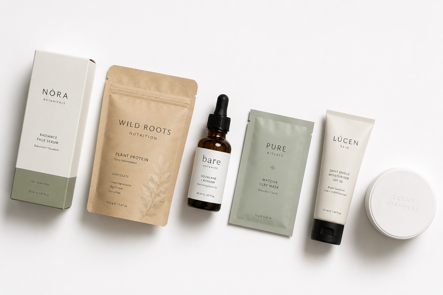
1. Emotional signal (0–0.5 seconds) Color, shape, and finish hit the emotional brain first. Before the shopper reads "natural" or "clinically tested," they've already felt something. Green and cream signal "safe and herbal." Black with gold signals "luxury." Neon orange says, "bold and energetic." These signals are processed automatically; the shopper doesn't decide to feel them.
2. Category identification (0.5–1.5 seconds) The brain asks, "Is this the kind of product I'm looking for?" If your packaging doesn't visually match the expected cues for your category, skincare, nutrition, or snacks, you lose the shopper before they even read the claim.
3. Trust and credibility assessment (1.5–3 seconds) Typography, print quality, and how crowded the text looks all contribute to a single judgment: “Does this brand know what it’s doing?” A low-resolution print, misaligned text, or muddy color combination answers that question negatively, instantly.
.png)
The 5 Packaging Design Factors That Drive Buying Decisions
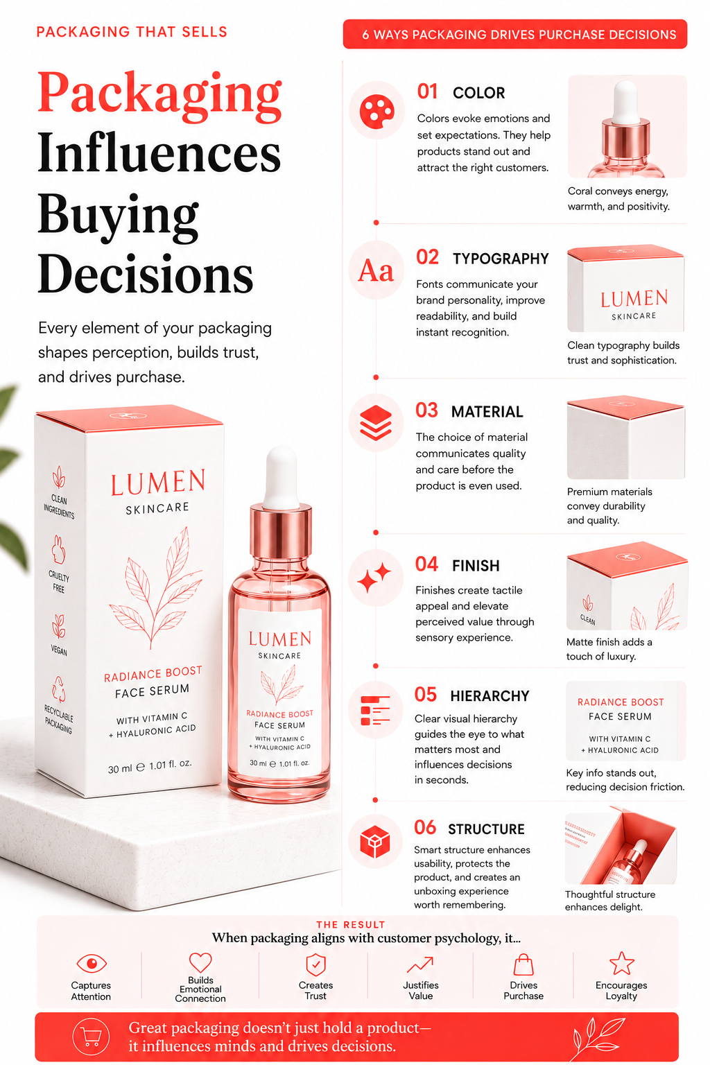
1. Color: The Fastest Signal Your Brand Sends
Color is responsible for up to 85% of the reason a consumer chooses one product over another, according to research published by the Journal of Business Research.
In the Indian D2C context, color is doing even more work because the category is noisier and shelf space is tighter. MCaffeine understood this early. Their packaging uses saturated neons: a bold departure from the greens, creams, and whites that dominate skincare shelves.
Every SKU is built around a single hero ingredient color, creating an overall look so distinct that a shopper can identify the brand from across a modern trade aisle without reading the name. That's color doing its job.
Compare this to most emerging Indian wellness brands: a white or kraft base, with a token green or gold accent. They look "clean" in isolation. On the shelf, surrounded by 40 other white-and-green packs, they disappear.
Color differentiation is a smart business choice, not just a design choice. The question isn't "what looks nice?" It's "what stands out in the exact context where my customer will see this?"
2. Typography: Where Trust Is Made or Lost
Typography is the single most underestimated element of packaging design in the Indian D2C space. Most founders treat typography as “the font we use,” instead of seeing it as a major factor in how premium and trustworthy the brand feels.
The Whole Truth is the clearest case study on this. Their packaging uses clean sans-serif fonts, no illustrations, and no unnecessary decorative elements.
Instead, every pack lists every ingredient in plain English with zero embellishment. The simple and clean text styling signals complete honesty, which is exactly what the brand stands for.
The result is not just aesthetic. It builds trust at the moment of purchase in a category where trust is the main reason people buy. A Redseer Strategy Consultants D2C market report found that ingredient transparency is one of the top 3 purchase drivers for urban Indian health food consumers.
The Whole Truth's typography communicates that transparency without saying, "We are transparent."
Founders should ask: Does your current typography tell a story, or does it just display text?
3. Structure and Shape: Differentiation Before Color Even Registers
Shape communicates before color does, because the brain processes three-dimensional form faster than surface detail. A bottle that fits differently in the hand, a pack with an unusual proportion, and a container with a structural feature: all of these create a distinct sensory memory.
Premium D2C brands in global markets have used structural design to create unboxing moments and tactile experiences that reinforce brand values. In India, the most successful structural moves have been simpler: Pilgrim's tall, slender bottles signal European minimalism in a market saturated with squat FMCG formats.
The shape says "this is different" before the consumer reads anything.
For brands launching in quick commerce (Blinkit, Zepto, and Swiggy Instamart), structure matters in a different way: your product must photograph well, stack neatly, and survive last-mile delivery.
A structurally distinctive pack that arrives damaged is worse than a simple pack that arrives intact.
4. Finish and Material: The Proxy for Product Quality
Shoppers cannot taste, smell, or test a product at the shelf. The packaging material and finish become the customer’s way of judging product quality.
Matte finishes signal restraint and a luxury or premium feel. Glossy surfaces signal energy, accessibility, and mass-market appeal. Soft-touch laminate creates a luxury feel that costs slightly more to produce but often performs much better at premium price levels.
MamaEarth's packaging evolution is a direct lesson here. Early SKUs used standard glossy packaging with green and cream colors that read as "budget herbal" to premium buyers.
Over 2022-24, Mamaearth shifted to cleaner typography, reduced llustration, and finishes more consistent with clinical skincare. The visual cue shift repositioned the brand toward efficacy, attracting buyers who were previously choosing Minimalist or Plum for their "scientific" aesthetic while retaining the core natural-skincare audience.
That's a packaging finish decision driving a brand repositioning. It works because the finish is what the consumer's hand tells them first.
.png)
5. Information Architecture: How You Tell the Story on Pack
Every square centimeter of your primary packaging is real estate. The question is what to prioritize and in what sequence.
The hierarchy on a pack should follow the customer's attention:
- Brand name / visual mark: Who are you?
- Product descriptor: What is this?
- Primary claim or benefit: why should I care?
- Supporting information: ingredients, certification marks, quantity
- Legal and compliance copy: FSSAI license, best before, MRP
Most founders reverse this order. They put FSSAI marks prominently because they're worried about compliance, push secondary claims to the front panel, and bury the primary benefit. The result is a pack that looks credentialed but doesn't sell.
Slurrp Farm gets this right. Their primary packaging leads with the child-facing illustration (emotional hook for parents), followed by the product name in large, friendly type, then the clean-eating claims ("millet-based," "no maida," "no refined sugar"). Regulatory information is present but doesn't compete for front-of-pack attention. The order of information matches how a parent shopping on a BigBasket shelf makes a decision: emotional trust first, category fit second, and ingredient proof third.
How Packaging Design Works Differently Across Indian Retail Channels
This is where many D2C founders make a strategic mistake: designing packaging for one context and expecting it to work everywhere.
Big retail store shelves (Reliance Smart, D-Mart, Spar): Shelf presence wins here. Your pack competes at 1-2 meters of distance. Color blocking, distinct shape, and clean hierarchy matter most. The pack needs to work in mixed lighting, next to competing brands, on a lower shelf.
E-commerce (Amazon India, Nykaa, BigBasket): Thumbnail performance is the only thing that matters before the click. Your product must be recognizable, the primary claim must be readable, and your brand colors must stand out in a grid of competitors. Products designed only for store shelves often fail in small online thumbnail: too much detail, too little contrast.
Quick commerce (Blinkit, Zepto, Swiggy Instamart): People shop quickly here, but attention spans are very short. Your product needs to be identifiable in a 60x60 pixel tile and look trustworthy enough for an impulse buy with no physical inspection. Clean backgrounds, single-subject photography, and strong brand color blocks work here.
Direct-to-consumer (your own website or D2C app): Here you can show the full packaging story. Lifestyle photography, unboxing sequences, and product detail shots all reinforce the premium signal your pack needs to justify its price point.
.png)
What Retailers Actually Judge When They See Your Packaging
If your goal is to enter retail: and for most Indian D2C brands scaling past INR 2Cr, it should be: your packaging will be evaluated by a buyer who sees hundreds of new products every month.
Modern trade buyers in India judge new brands on four packaging signals in the first meeting:
- Category fit: does the pack look like it belongs in the category section?
- Brand confidence: Does this look like a brand with staying power or a startup prototype?
- Consumer communication: can a shopper understand what this is and why they should buy it in 5 seconds?
- Proper labeling and being ready for store shelves: is it FSSAI-compliant, clearly labeled, and physically shelf-ready?
Founders who walk into retailer meetings with subpar packaging, even with excellent products, lose the listing. Not because the buyer doesn't like them. Because the buyer cannot justify listing a product that won't perform on the shelf. Your packaging is what sells your brand to retailers.
Yoga Bar understood this when scaling into modern trade. Their clean, color-coded bar packaging with bold flavor names and clear nutritional claims made it easy for retail buyers to place SKUs in the health food section and for shoppers to navigate the range. The packaging itself helped sell the product.
The Packaging Design Mistake That Costs Indian D2C Brands the Most
The single most expensive packaging mistake Indian D2C founders make designing for how the product looks on screen and failing to test it in context.
Designing on a computer screen, in good lighting, at full resolution, with no competing products nearby is completely different from how your customer actually encounters it. Your packaging must be tested:
- At the shelf, under fluorescent retail lighting, next to competitors
- At thumbnail scale (resize your packaging image to 100x100 pixels and look at it).
- In a photo: how does it photograph for Instagram and paid ads?
- In hand: How does it feel? Does the material communicate the quality?
- On delivery: does it arrive without damage? Does it open correctly?
Brands that skip this testing spend INR 4-8L on a packaging redesign and discover the problems only after the first retail buyer meeting or the first Amazon launch.
Jellypop's packaging design process includes print-ready and retail-context reviews precisely because design that looks right on screen frequently fails in the real world.
What Good Packaging Design Actually Costs in India
Packaging design projects in India range widely. A freelancer on Upwork or Fiverr charges INR 8,000–INR 40,000. A specialist D2C studio charges INR 1.5L– INR 6L for primary packaging. A complete packaging system covering multiple products, brand integration, and print-ready packaging files can cost between INR 3L–INR 10L.
The cost of bad packaging is not the design fee. It is the lost retail listing, the poor Amazon click-through rate, and a brand that still fails to get sales despite having a great product. Those costs are multiples of the design spend.
See our guide to packaging design costs for Indian D2C brands for a full breakdown.