.png)


Consumer Psychology in Packaging Design: What Makes Shoppers Pick Up Your Product
Consumer psychology in packaging design is the study of how visual, structural, and tactile cues on a package influence a shopper's decision to pick it up, trust it, and buy it: before reading a single line of copy.
The best packaging doesn't make consumers think harder. It makes decisions easier. Every design choice either reduces friction or creates it.
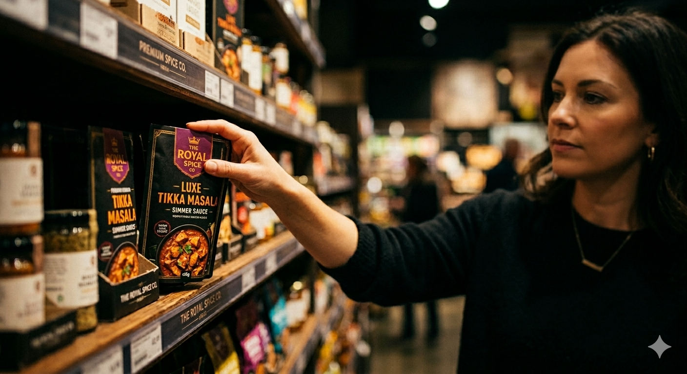
Your packaging isn't just a wrapper. It's a silent salesperson making a case in under three seconds. In Indian retail, where a Blinkit product grid or a BigBasket listing shows twelve competing products side by side, the psychological trigger that makes a shopper's eye land on your product is design, not price.
This is what separates packaging that performs from packaging that just looks good.
Why Packaging Psychology Matters More Than Ever for Indian D2C Brands
India's D2C market is growing fast, and customer acquisition costs are rising with it. That means every rupee spent on paid acquisition has to be backed by a product experience that converts at the shelf, the thumbnail, and the unboxing.
Packaging is one of the few touchpoints most customers encounter regardless of channel. It works in a Reliance Smart aisle, on a Nykaa product page, in a Blinkit dark store, and in an Instagram unboxing reel. Getting the psychology right multiplies the impact of everything else you spend.
The founders who treat packaging as a functional necessity: something to contain the product and list the ingredients: consistently lose shelf space and repeat purchases to brands that treat it as a conversion tool. See how packaging design directly affects sales: read our breakdown of how packaging design influences buying decisions.
The 3-Second Rule: How Shoppers Actually Decide
Shoppers don't evaluate products: they react to them. Shoppers form first impressions within seconds. In quick commerce, that window shrinks further. Your product thumbnail on Amazon India has to compete for attention at 200 pixels wide.
In those first few seconds, the brain processes:
- Shape and silhouette: Is this product familiar or new? Does the structure signal the category?
- Colour: What emotion does the dominant colour trigger?
- Hierarchy: Where does the eye go first? What's the product name, what's the claim?
- Texture signals: Even on a screen, matte, gloss, embossed, and kraft surfaces communicate quality cues.
Shoppers aren't reading your labels in those first few seconds. They're matching what they see against memory and category expectations. Good packaging design works within those patterns: or breaks them intentionally with a reason.
Packaging should quickly answer three questions:
- What is this?
- Why should I trust it?
- Why should I choose it?
Colour Psychology: The Fastest Purchase Signal
Colour is the fastest carrier of psychological meaning. It communicates before the brain processes words. For D2C brands in India, choosing the wrong colour is the single most common design mistake: particularly in crowded categories like skincare and wellness.
The goal isn't choosing colours consumers like. The goal is choosing colours that reinforce positioning and stand apart from competitors.
Here's how colour psychology maps to category expectations in Indian D2C:
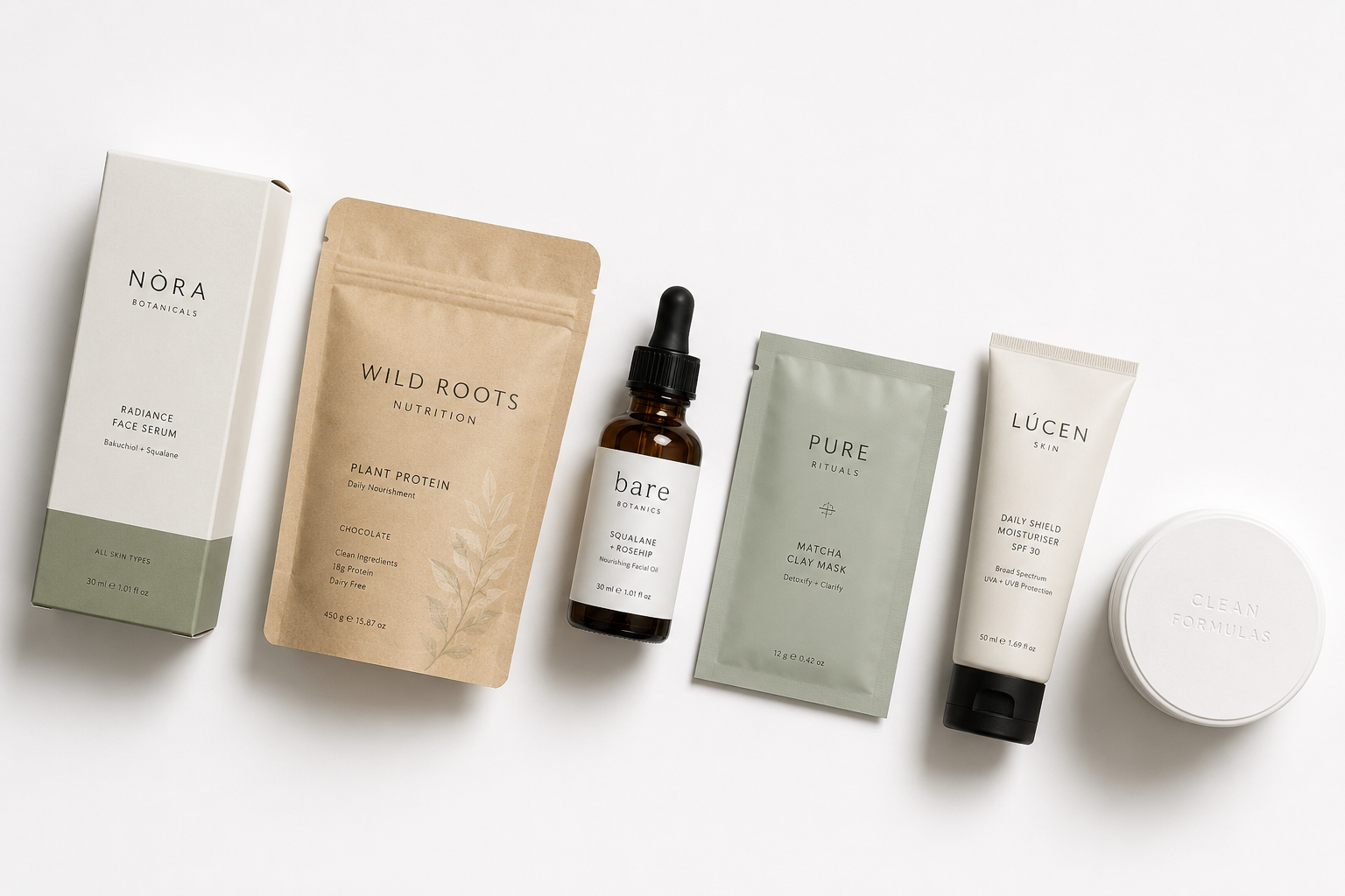
- White and clinical tones: Signal trust, effectiveness, and science. Minimalist's ingredient-led skincare uses white precisely because it communicates pharmaceutical honesty over cosmetic glamour. Pilgrim does something similar: clinical white offset with muted botanicals to sit between Korean skincare and natural Indian remedies.
- Neon and bold brights: Signal energy, youth, and category disruption. MCaffeine's neon-and-black packaging makes the caffeine claim visual before it's read. The packaging feels like a jolt. That's intentional.
- Earthy greens and creams: Signal natural, trusted, and clean. Mamaearth built its early brand recognition on these tones, then moved toward a more clinical look to capture buyers who wanted proven results, not just natural claims.
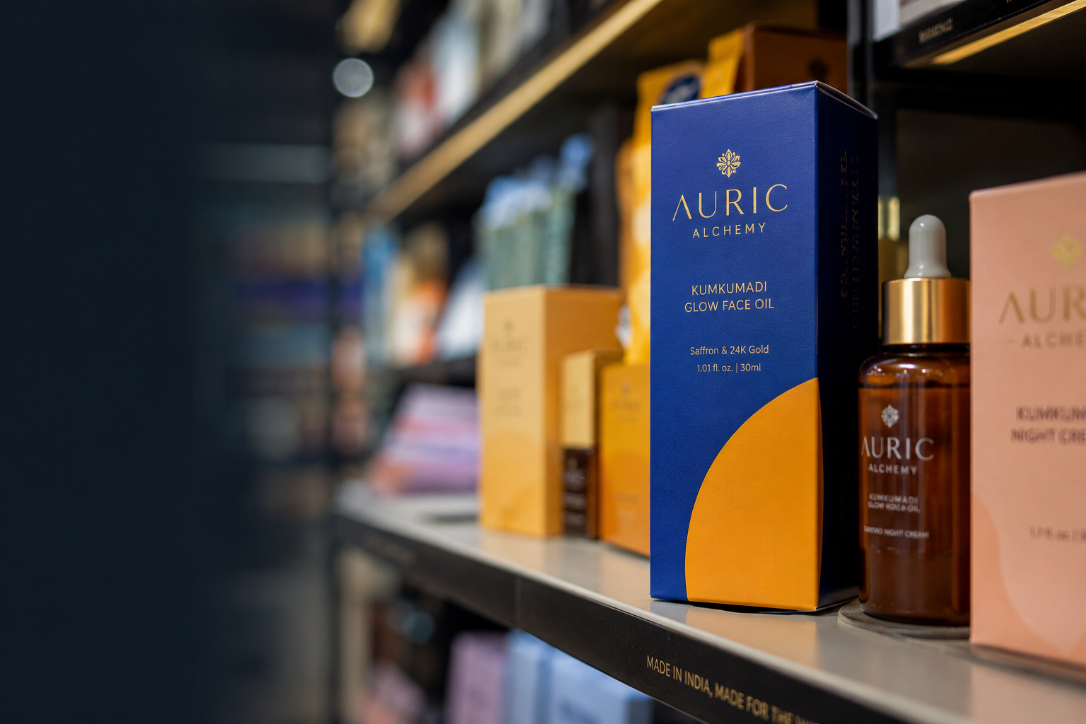
- Deep jewel tones (navy, forest green, burgundy): Signal premium and luxury. These consistently justify higher prices: an important cue for brands competing above the INR 500 price point.
The risk in India's D2C market is category colour saturation. If every clean food brand uses kraft and green, the category becomes visually uniform. Slurrp Farm broke this with bright, warm, playful tones that signalled trust to parents without looking like every other "natural" kid's snack. The category contrast gave them shelf visibility that competitors in the same green range couldn't match.
Typography Psychology: What Your Font Is Saying Without Words
Typography has two jobs: communicate personality and communicate information. Most packaging failures happen when brands focus on personality and sacrifice readability.
Font psychology operates on two axes:
- Personality: Serif fonts carry tradition, authority, and craft. Sans-serif fonts carry modernity, clarity, and accessibility. Script and handwritten fonts carry warmth and founder personality. Each category has a default: and departing from it requires a clear reason.
- Legibility: Packaging has to work at multiple sizes. The same type that looks elegant in a design file can become unreadable at shelf distance or in a product thumbnail.
The winning combination for Indian D2C packaging is a high-legibility primary font for product name and category claim, with a secondary font for brand name and tone. The Whole Truth does this well: a bold, clean primary font for ingredient transparency, with a warmer secondary treatment for the brand name.
Perceived Value: How Packaging Changes What Shoppers Think Your Product Is Worth
This is the most commercially important psychological lever in packaging design, and the least understood by early-stage D2C founders.
Packaging does not increase product quality. It increases confidence in product quality. Consumers use packaging as a shortcut when they cannot judge the product itself. And that shortcut directly affects what they're willing to pay.
Perceived value is not the same as actual value. A product in premium packaging is perceived as worth more: consumers consistently rate identical products higher in quality when they're packaged better. In India's growing shift toward premium products, this is a direct commercial opportunity.
The cues that drive perceived value upward:
- Material quality: A matte, textured carton signals premium over a gloss-laminated box, even when the product inside is identical.
- Structural design: A rigid box, a weighted cap, an induction seal: structural cues that require more effort or cost signal higher product quality.
- White space: Packaging that doesn't fill every centimetre with copy signals confidence. The brand trusts the product.
- Print finishes: Raised glossy text (Spot UV), soft-touch lamination, foil stamping: each finish communicates that the brand invested in the presentation.
- Typography restraint: Fewer fonts, more space, precise hierarchy. Clutter signals mass market. Restraint signals premium.
For brands at the INR 400–INR 1,200 price point, packaging that signals premium is the difference between a one-time trial and a repeat customer who believes the price is fair.
Read our full analysis on how premium packaging increases product value: with specific examples from Indian D2C brands.
Storytelling and Emotional Triggers in Packaging
Shoppers don't just buy products. They buy what a product represents: a version of themselves, a set of values, a daily ritual. Packaging that tells a story gives the shopper a reason to make that emotional connection.
Stories are easier to remember than information. Facts help people evaluate products. Stories help people remember them.
The most effective storytelling on packaging operates through:
- Origin narratives: Where did this product come from? Who made it? The Whole Truth prints its founding philosophy on every pack: "no bullshit nutrition" is a positioning statement that doubles as a story.
- Hero ingredients: Highlighting a single key ingredient, like MCaffeine's coffee, makes the story concrete. The shopper isn't buying skincare; they're buying a specific active with a specific reason.
- Visual language: The illustration style, the iconography, and the logo design all tell a story before any copy is read.
- Copy tone: The words on packaging are part of the design. Informal, direct copy signals a founder-led brand with personality. Clinical, precise copy signals effectiveness. Neither is wrong: but they must be consistent with every other visual cue on the pack.
Learn how to build your brand narrative into your packaging from the ground up: see our deep dive on storytelling through packaging design.
How Consumer Psychology Plays Out Differently Online vs Offline
Many brands assume packaging performs the same across channels. The psychological triggers are similar, but their importance changes.
Indian D2C brands that don't account for this consistently underperform in one channel.
Physical shelf psychology:
- Colour and silhouette are primary: the eye scans from distance
- Tactile cues matter: weight, texture, and material communicate in hand
- Category grouping creates comparison: your packaging must stand out from the twelve products next to it
- Front-of-pack hierarchy must work at arm's length
Online and quick commerce psychology:
- Thumbnail legibility is everything: can your product name and category claim be read at 200 pixels?
- The main product image matters more than structural design
- Ratings become more influential after packaging has successfully captured attention
- Lifestyle context in the main image does more psychological work than structural design
Brands like Sugar Cosmetics have designed explicitly for both: their primary packaging has physical shelf visibility (bold colour, high contrast), and their online imagery uses lifestyle and ingredient context to handle the trust-building that in-store experience would otherwise do.
What This Means for Your Brand's Packaging Brief
If you're designing or redesigning your packaging, consumer psychology isn't a layer to add at the end. It's the strategic foundation the brief should start from.
Before any design decisions are made, a well-built packaging brief should answer:
- What category cues does the shopper use to navigate this shelf?
- Which psychological triggers: effectiveness, naturalness, premium, fun, trust: align with our brand positioning?
- Which of those triggers is our primary competitor already owning?
- In what contexts does our shopper encounter the product: retail shelf, quick commerce thumbnail, website, unboxing?
- What emotion should the packaging produce at first sight? At first touch? At unboxing?
These are not marketing questions. They're design questions that determine every visual decision that follows: colour, structure, typography, finish, hierarchy.
Getting them right before a single concept is sketched saves three redesign cycles and a failed retail pitch.
If your current packaging isn't doing this work, see our packaging design for D2C brands service: built specifically for Indian founders who need packaging that converts.