.png)





How to Design Packaging for Beauty Brands: A Practical Design Framework
Designing packaging for a beauty or skincare brand means making six decisions in order: positioning, structure, color, typography, material, and compliance. Get the order wrong, such as picking colors before positioning or material before structure, and you end up redesigning later at a much higher cost.
Beauty packaging carries more functional weight than most categories. The same pack has to dispense product correctly, survive a bathroom shelf, preserve formulation integrity, and still look distinct enough to justify its price tier on a Nykaa listing, an Amazon Beauty page, or a Blinkit thumbnail (the small square image a product shows in a scrolling app grid) no bigger than your thumb. Packaging in this category directly affects perceived efficacy, pricing power, and conversion rate before a customer has ever tried the product.
This is also one of the most crowded categories in Indian D2C (direct-to-consumer, meaning a brand selling straight to shoppers rather than through a separate retailer). Skincare, color cosmetics, and personal care launch faster than almost any other vertical, so generic packaging disappears instantly. The six-step framework below is built for beauty, but the same ordering logic, positioning first, structure second, applies just as directly to food, beverage, and supplement packaging, where founders make the identical mistake of picking color before settling positioning.
What Makes Beauty Packaging Different From Other Categories?
Beauty packaging has to do three things food or apparel packaging does not: dispense product precisely through pumps, droppers, or applicators; survive repeated bathroom or vanity use without degrading; and carry ingredient and compliance information that a label-reading buyer will actually check before purchase.
It also has to protect what is inside, since formulation stability is a packaging requirement, not just a design consideration. Active ingredients degrade at different rates depending on the packaging material and format.
- Vitamin C (ascorbic acid) oxidises rapidly when exposed to air and light. Airless pumps, opaque or frosted packaging, and UV-resistant glass are structural requirements for Vitamin C formulations, not optional upgrades.
- Retinol and retinoids are similarly light-sensitive and require packaging that limits both air and light exposure: dark glass, opaque tubes, or airless dispensers.
- Niacinamide, AHAs, and peptides are more stable but still benefit from airless or pump formats that prevent contamination from repeated finger contact.
Choosing structure based on aesthetics while ignoring formulation compatibility is one of the most expensive mistakes in early-stage beauty packaging, particularly because certain formulations react with specific plastics or metals, altering the product's efficacy and shelf life before the customer even opens the pack.
In India, cosmetics packaging also falls under the Drugs and Cosmetics Rules administered by CDSCO (the Central Drugs Standard Control Organisation, India's drug and cosmetics regulator), on top of standard Legal Metrology declarations like MRP and net quantity that apply to every packaged product, including food and supplements. Getting the functional and regulatory layer right is what makes the aesthetic layer possible: a beautiful pack that does not dispense well or is missing a mandatory declaration gets returned or held up before a customer ever judges the design.
.png)
Check your own formulation against this list before locking structure, since a mismatch caught here is far cheaper to fix than one caught after the first batch starts degrading on shelf.
Step 1: Decide What Your Packaging Needs to Promise
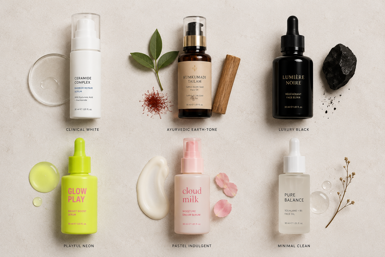
Before any visual decision, define the one positioning territory your packaging needs to communicate at a glance. This single decision determines almost every choice that follows, and beauty positioning territories in Indian D2C cover a wider spectrum than most founders initially brief for.
- Clinical / dermatologist-led: Efficacy-first, ingredient-percentage-led, white and blue palette, precise typography. Minimalist and Fixderma operate here.
- Science-backed: Similar to clinical but warmer and more accessible, positioning the science as a benefit rather than a badge. Pilgrim and Dot & Key occupy this space.
- Natural / Ayurvedic: Earth tones, botanical illustration, serif or hand-lettered typography, organic material signals. Forest Essentials, Kama Ayurveda, and early-era Mamaearth built here.
- Clean beauty: Minimalist aesthetics with a transparency and ingredient-honesty angle, closer to clinical in visual language but driven by ethical positioning rather than dermatology.
- Indulgent / self-care: Softer palettes, tactile finishes, sensory-first messaging. Positions the product as a ritual rather than a treatment.
- Playful / Gen Z: Bold color, expressive typography, irreverent tone. MCaffeine's positioning in a skincare context, the same tone it carries across its beverage line.
- Luxury: Dark, restrained packaging, premium substrates, minimal text, often structural differentiation. Forest Essentials and Ohria Ayurveda at higher price points.
Pilgrim built its entire packaging system around a Korean-beauty-inspired ritual feel, using soft pastel tones, rounded typography, and a tactile matte finish that signals self-care rather than treatment. Competitors in the same ingredient categories often default to clinical, sterile-looking packaging. Pilgrim's gap was making efficacy feel indulgent rather than medical, and that single positioning decision shaped every downstream design choice the brand made.
Name your positioning territory in one phrase before moving to Step 2, since every structure, color, and material decision that follows should trace back to this single answer.
Step 2: Choose Structure Based on Product Texture and Usage
Structure should follow how the product is actually used, not what looks best in a flat-lay photo. This is also the decision with the highest cost of getting wrong, since structural molds and tooling are far more expensive to change after production than color or typography.
This same usage-first logic applies outside beauty too: a cold-pressed juice brand chooses a bottle based on cold-chain handling, and a protein supplement brand chooses a tub based on scoop access and moisture control, not on what photographs best.
Packaging compatibility with formulation is a real-world consideration most early-stage founders miss entirely. Certain formulations react with specific materials over time: acidic formulations can leach from low-grade plastics, essential oil-heavy products can degrade certain polymer containers, and metal closures can react with high-pH formulations. Confirm packaging material compatibility with your formulation chemist before finalising structure.
Long-term formulation stability is also a structure decision. Airless formats extend shelf life by eliminating air exposure, UV-resistant glass or opaque packaging preserves light-sensitive actives, and jars introduce contamination risk through repeated finger contact. These are not premium features; they are functional requirements that affect whether your product performs as claimed at the end of its shelf life.
Match your product texture against the table above and confirm formulation compatibility with your chemist before any mold or tooling decision is finalised.
Step 3: Build a Deliberate Color Strategy
Color is the fastest signal a beauty product sends, and it is also the easiest thing to get generically wrong. Beige-on-white "clean beauty" packaging is now so common it has stopped standing out. A deliberate color strategy starts with positioning from Step 1 and maps directly to the visual territory you need to own.
Positioning-to-color framework:
Sugar Cosmetics took a deliberate departure from the pastel, Eurocentric color stories that most global beauty brands used in India, building a high-contrast color system around Indian skin tones instead. Competitors targeting the same audience leaned on softer, aspirational palettes. Sugar's gap was visibility and representation, and that color decision is a meaningful part of why the brand reads as distinct on a crowded Nykaa shelf.
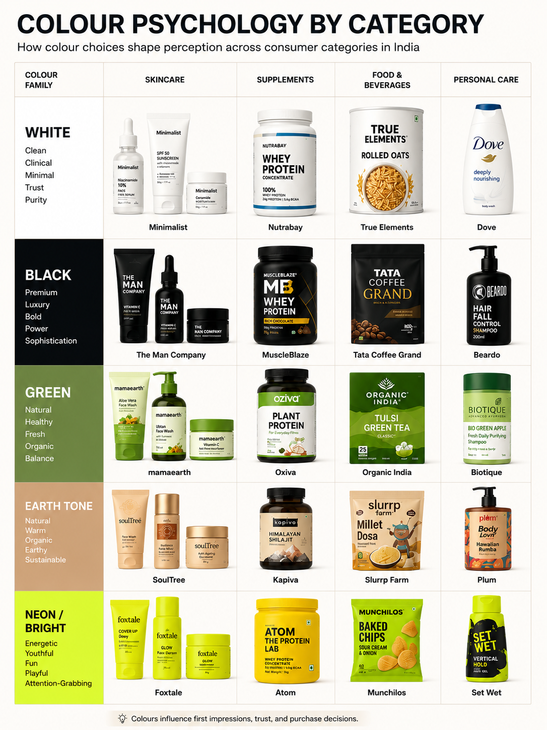
See our guide to best colors for skincare packaging for a full breakdown of what different palettes signal by category and skin concern.
Match your color direction to the positioning you named in Step 1, not to what looks appealing in isolation, and check it against three competitor shelves before finalising.
Step 4: Choose Typography That Matches Your Brand Tone
Typography is doing more work than most founders credit it for. A clinical skincare brand using a rounded, friendly typeface undercuts its own credibility, just as a playful color cosmetics brand using a serious serif (a typeface with small decorative strokes at the ends of letters) feels mismatched on shelf.
Typography in beauty packaging also has to survive at very small sizes. Most beauty packs carry more mandatory text than founders initially plan for: ingredient lists in INCI names (the standardised international naming system for cosmetic ingredients), usage instructions, shelf life declarations, compliance information. A typeface that looks elegant at 40pt but becomes illegible at 6 to 8pt on the back panel is a structural problem, not a stylistic one, since the minimum legibility threshold for beauty packaging body copy is 6pt in most print contexts.
Practical checks before finalising a typeface:
- Print the label at actual production size and read the back panel at arm's length
- Check that INCI ingredient names, which are often long and technical, remain readable at the smallest size they will appear
- Confirm the primary typeface works at thumbnail scale for ecommerce listings, tested at 100px width on a phone screen
.png)
See our guide to best fonts for packaging design for a full breakdown of legibility thresholds, tone-matching by category, and how to pair typefaces across a beauty packaging system.
Run the three checks above on your shortlisted typeface before it goes to print, not after the proof comes back.
Step 5: Get the Material and Finish Right
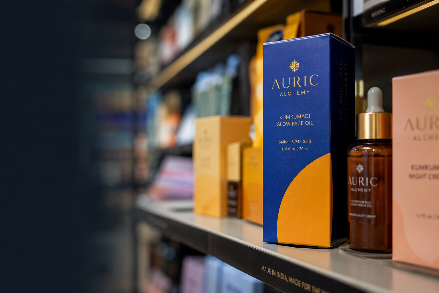
Material is where price tier and brand promise either align or visibly clash. A serum positioned at an upscale price point but packaged in a thin, flexible plastic bottle undercuts its own pricing the moment it is held. The right material choice follows directly from the positioning decided in Step 1.
Material signals at a glance:
- Glass: signals concentration, permanence, and an upscale feel. Heavier glass carries more perceived value than thin glass. Best for serums, face oils, and premium toners.
- Matte-finish plastic or aluminum: signals modern, considered minimalism. Lighter than glass but reads as deliberate and restrained rather than cheap when executed correctly.
- Frosted glass: premium without the weight of clear glass. Softens the clinical signal while retaining the quality cue.
- Standard gloss plastic: reads as mass-market regardless of the formulation inside, unless the design and label quality compensates significantly.
Finish decisions and what they communicate:
Sustainability considerations:
Sustainability is an increasingly important purchase signal in Indian beauty, particularly among the urban, ingredient-aware buyer that most D2C skincare brands are targeting, and the same buyer behaviour shows up in clean-label food and conscious-consumption beverage categories.
Options worth evaluating at the brief stage include post-consumer recycled (PCR) plastics, which reduce virgin plastic use without requiring structural changes; refill-compatible formats, which are beginning to appear in premium Indian D2C; and mono-material packaging, which is easier to recycle than multi-layer laminates.
A sustainability claim on packaging needs to be accurate and specific: a stated percentage of recycled material is defensible, while "eco-friendly packaging" without substantiation is not.
See our guide to best packaging materials for premium brands for cost, sustainability, and perceived-value tradeoffs across the common options.
Shortlist your material and finish only after your retail price tier is locked, so the material choice supports the price rather than fighting it.
Step 6: Design for Both the Shelf and the Screen
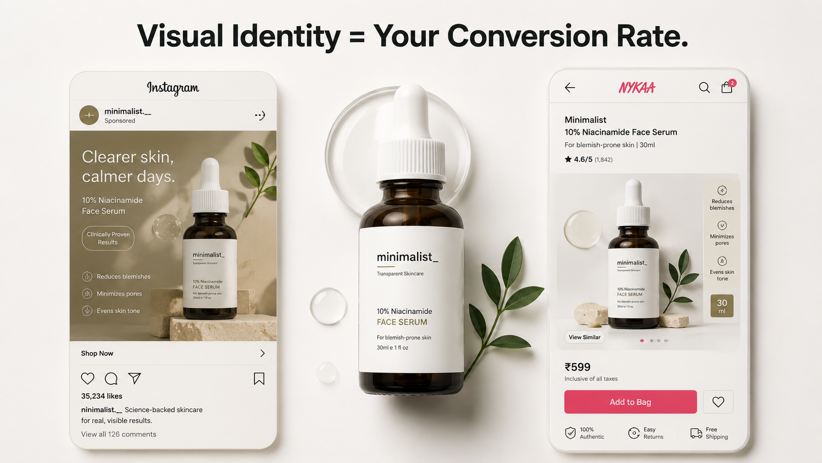
Most beauty purchases in India now start on a phone screen, on Nykaa, Amazon Beauty, Blinkit, or Instagram, before they are ever held in hand. That means your packaging needs to perform at two completely different scales: legible and distinct as a thumbnail, and tactile and premium-feeling once it arrives.
Thumbnail validation checklist (run before production):
- Can the brand name or logo be read at 100px width on a phone screen?
- Can a shopper identify the product category instantly at thumbnail scale, without reading any text?
- Is the brand's primary color still recognisable and distinct from competitors when the image is reduced?
- Does the primary claim survive, or does it collapse into unreadable detail at small size?
- On a Blinkit or Zepto grid (80px), does the pack still create a visual break from competitors around it?
If any of these fail, the design needs adjustment before print files are finalised. Discovering thumbnail failures after a production run means discovering them on a live listing, after real conversion data has already been affected.
A pack that photographs beautifully for unboxing content but reads as cluttered at thumbnail size will lose conversions before a customer ever opens the box, the same problem a coffee bag or snack pouch designed shelf-first runs into on quick commerce.
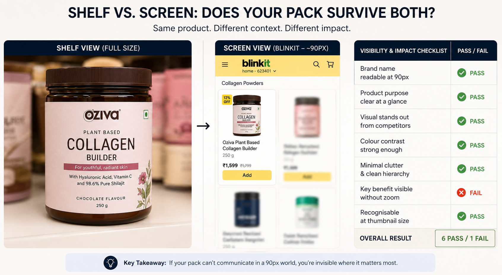
See our guides on how to create instagrammable packaging and how to improve product shelf appeal: the two contexts demand different hierarchy decisions and are worth reviewing separately before production.
Run the five-point checklist above on your final design at actual thumbnail size before sending files to print.
Compliance Checklist for Beauty Packaging in India
Before any pack goes to print, confirm all of the following are present and accurate. Verifying these against current CDSCO and Legal Metrology regulations before production is strongly recommended, since regulations do update and the version your printer or designer last worked from may not be current.
- Legal Metrology declarations are complete: MRP inclusive of all taxes, net quantity or net weight, manufacturer or importer name and address, and country of origin where applicable.
- Manufacturing license number under the Drugs and Cosmetics Rules is present on the label.
- Batch number or lot number is included for traceability.
- Expiry date or best before date is stated: for cosmetics, the period after opening (PAO, the symbol showing how many months a product stays usable once opened) is also required where applicable.
- Importer details are included if the product or any component is manufactured outside India.
- Cosmetics-specific labeling is complete under the Drugs and Cosmetics Rules, including the full ingredient list in standard INCI naming, not marketing names, on the mandatory information panel.
- Shelf life and usage period (period after opening) are stated where the product category requires it.
- Claims are substantiated. "Dermatologically tested," "clinically proven," and "hypoallergenic" claims need to be backed by actual testing documentation, not used as default marketing language.
This checklist covers common requirements but is not a substitute for legal review. Confirm your specific product category requirements with a regulatory consultant before printing.
Run this eight-point list against your label proof and get sign-off in writing before the print order is placed.
Why Premium-Feeling Packaging Pays Off for Beauty Brands
Beauty is one of the few categories where packaging directly influences perceived efficacy. This is not vanity; it is a documented pattern in consumer psychology.
When a shopper cannot evaluate a formulation at the point of purchase, which is always the case in beauty, they use the packaging as a quality proxy, and the weight of the bottle, the tactile quality of the finish, and the precision of the label all become signals that tell the buyer whether the product inside is likely to work.
This creates a direct pricing power implication. A product in considered, upscale-feeling packaging can support a higher retail price than the same formulation in generic packaging, not because the packaging changes the formula, but because it changes the buyer's expectation of the formula before they use it.
The same logic applies to a coffee brand charging more for a heavier glass jar, or a supplement brand charging more for a tub with a precise scoop and a clean label.
A pack that feels considered buys you the benefit of the doubt on performance before a single drop has been used. A pack that feels inconsistent with the price creates doubt at the moment of purchase, and doubt at that stage is the primary reason a customer puts something back.
.png)
See our guide on how premium packaging increases product value for a deeper breakdown of this mechanism and what it means for D2C pricing strategy.
Audit your current packaging against this three-step chain and identify where the perception breaks down before assuming the formula needs to change.
Common Mistakes Beauty Brands Make With Packaging
The same mistakes repeat across most early-stage beauty brands. They are all fixable before print and expensive after it.
1. Choosing color before positioning is settled. Color chosen without a positioning brief defaults to the designer's taste rather than the buyer's category expectation. The result is packaging that looks nice and communicates nothing useful, or worse, communicates the wrong thing about the price tier or category.
2. Choosing structure based on photography rather than usage. A wide-mouth jar photographs beautifully, but it is also a hygiene concern in formulations that should not have repeated finger contact. Structure decisions made for aesthetic reasons without formulation input produce packaging that underperforms in real-world use, and real-world use is what drives repeat purchase.
3. Ignoring thumbnail visibility. Packaging designed at full size under good lighting and then shrunk to a Blinkit or Nykaa thumbnail without testing almost always loses key visual information at scale. The thumbnail test takes ten minutes before production and cannot be done after.
4. Copying global beauty brand aesthetics without adapting for Indian context. Muted Scandinavian minimalism or high-contrast monochrome aesthetics borrowed from European or US brands can feel imported and disconnected to an Indian buyer's visual vocabulary. Sugar Cosmetics built an entire brand advantage out of the gap left by global brands that did not adapt for Indian skin tones and Indian retail contexts.
5. Treating compliance as an afterthought squeezed into remaining space. Compliance text built into the layout from the start integrates cleanly. Compliance text added after the design is finalised either forces a layout rebuild or ends up in a font size that fails the legibility threshold, creating both a design problem and a regulatory risk simultaneously.
6. Choosing materials before the pricing strategy is confirmed. A material decision made before the retail price is locked can produce either a packaging cost that destroys margin or a material that undercuts the price point. Unit packaging cost should be modelled against the target retail price before any material is shortlisted.
Go through this six-point list against your own plan and flag anything you recognise before it becomes a print-stage problem.
When to Bring In a Packaging Design Agency
A founder can usually nail down positioning and a rough structure preference internally. The stage at which most early teams either lose weeks to trial and error or produce a pack that looks right but does not function or comply correctly is color system development, typography selection, material sourcing, compliance-accurate print file preparation, and printer coordination.
It is worth considering a packaging agency when:
- You are launching multiple SKUs and need a visual system that extends consistently across the range
- You are entering modern trade or a new retail channel where the packaging will be evaluated by retail buyers, not just end consumers
- Your compliance requirements are complex: multiple markets, imported ingredients, or claims that require substantiation documentation
- Sales performance from the current packaging is below expectations and the cause is not clear
- You are rebranding after a positioning shift and need the packaging to carry new meaning across an existing product range
Our packaging design service is built around the structure, compliance, and shelf-and-screen requirements covered above.
For brands scaling across SKUs, our skincare packaging design agency work focuses on building a system that holds up across a growing product line, not just a single hero SKU.
Good beauty packaging is not the prettiest option on the table. It is the option that gets the order right, positioning, structure, color, typography, material, compliance, so nothing has to be redone after the first production run.