.png)





How Visual Identity Affects Conversions: A D2C Brand Guide for Indian Founders
What Is Visual Identity and Why Does It Convert?
Visual identity is the complete set of visual elements that represent a brand: the logo, colour palette, typography system, packaging design, iconography, and the consistent way these elements appear together across every touchpoint.
It is not decoration. For a D2C (direct-to-consumer) brand, meaning a brand that sells straight to the shopper online without a retailer in between, visual identity is the first salesperson: the thing a consumer sees before they read a single word of copy.
A consumer encountering a new brand on Nykaa, BigBasket, or a Blinkit grid (the listing page shoppers scroll through to compare products) has less than two seconds to decide whether to click or scroll past.
In that window, visual identity functions as a primary attention and trust driver, alongside price, reviews, and product claims that all come into play once the click happens. A brand that looks established, consistent, and premium earns the attention that makes those other factors matter.
A brand that looks unfinished may lose that attention to a competitor that built a stronger visual system. This is not about beauty, it is about trust signals, and trust is what creates the conditions for conversion. The pattern holds across categories: skincare, packaged food, and personal care all compete for the same two seconds of attention.
See our guide to how branding affects customer trust to understand the psychological mechanisms that make consistent visual identity a direct driver of purchase decisions.
.png)
The 5 Visual Identity Elements That Directly Drive Conversions
1. Logo and First-Impression Trust
A logo does one specific job in the conversion process: it signals whether this brand is real, established, and worth trusting. It does not need to be clever, and it does not need to tell the whole brand story. It needs to look like it belongs in the category at the price tier you are positioned in.
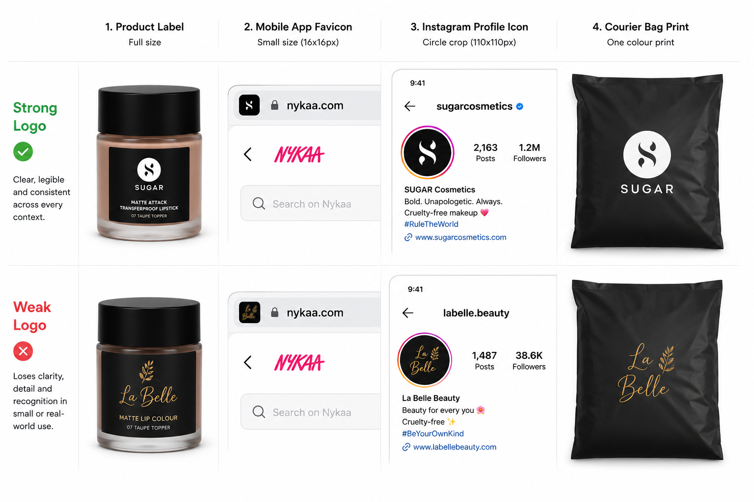
Sugar Cosmetics built a sharp, geometric wordmark (a logo made from the brand name styled as text, with no separate symbol) that reads as modern and premium at a mid-tier price. It holds up as a favicon (the small icon shown in a browser tab), a product cap emboss, a social handle, and a retail shelf tag, without changing.
Faces Canada and Lotus Herbals, operating in the same mid-tier segment, apply their brand marks with less consistency across retail formats. The discipline of a well-built logo system is not about outperforming competitors on any single metric.
It is about showing up identically across every surface a consumer encounters, which accumulates into trust over time. A logo that pixelates on mobile, disappears on dark packaging, or looks different on the product versus the website creates friction in the seconds a shopper gives a new brand.
Fix it: Check your logo at favicon size, on your darkest packaging colour, and on your lightest. If it degrades in any of the three, simplify it before you scale further.
See our guide to logo design for D2C brands to understand what makes a mark hold up across packaging, app icons, and retail formats.
2. Colour Psychology and Purchase Intent
Colour is one of the fastest brand signals the human brain processes, before shape, before typography, before copy. In the Indian D2C context, colour does more than set mood: it signals category, positions price tier, and creates scroll-stopping contrast on a crowded grid.
Research in consumer behaviour consistently supports the idea that colour is a primary driver of brand attention, though its effect varies by category, platform, and audience.
MCaffeine built their brand identity around neon yellow and dark backgrounds, a high-energy visual language that stands out on a Blinkit grid where most competitors default to white or pastel.
The contrast is intentional: it communicates "this is not another gentle wellness brand" before a consumer reads the word "caffeine." Their target buyer, urban 25 to 35, gym-going, stimulant-positive, responds to that energy level, which makes the colour choice a positioning decision expressed through colour rather than a purely aesthetic one.
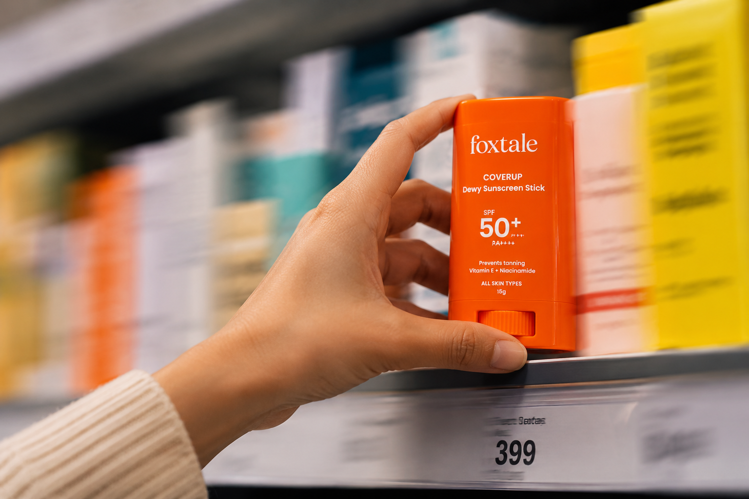
The mistake most D2C founders make with colour is choosing what they like rather than what is distinct in their specific retail context. A colour that works on Instagram may disappear on a BigBasket category page, and a palette that reads as premium on a white Nykaa background may look washed out on a pharmacy shelf.
Colour decisions need to be tested across the specific surfaces where your customer encounters your brand, because performance varies meaningfully by context.
See our guide to consumer psychology in packaging design to understand how colour signals work by category, and why testing in context matters before finalising a palette.
.png)
3. Typography and Brand Credibility
Typography is the visual identity element most founders underestimate. In D2C branding, typography carries two signals: credibility and clarity. A brand that uses inconsistent fonts across packaging, website, and social ads looks like it was built by different people in different moods, and that inconsistency reads as unprofessional at a premium price point.
The Whole Truth built a typography-dominant visual identity at a time when most Indian health food brands were leaning on illustration and photography. Their packaging is almost entirely type: bold, declarative, no-nonsense. It works because the typography system is rigorous: one typeface, one weight hierarchy, one consistent application across every product.
The typographic boldness is the brand personality made visible. A consumer picking up a The Whole Truth protein bar reads the brand's values in the font before they read the copy.
Practical typography takeaway: Limit your system to one or two typefaces, one for headlines and front-of-pack hierarchy, one for body and compliance copy. Weight variation within the same type family creates cleaner hierarchy than adding a third font. Founders using default platform fonts or switching typefaces between products are creating a recognition problem at every touchpoint.
See our guide to best fonts for packaging design for a full breakdown of typeface categories, pairing logic, and legibility thresholds for packaging contexts.
4. Packaging as a Conversion Surface
Packaging is where visual identity does its hardest conversion work. It operates in three contexts simultaneously: the retail shelf (physical or digital), the unboxing moment, and the repeat-purchase trigger every time the customer uses the product at home.
On a Nykaa shelf tile or a Blinkit category grid, the packaging thumbnail (the tiny preview image of your product shown in search results and category listings) is roughly 80x80 pixels. At that size, typically three things survive: dominant colour block, readable brand name, and one clear claim. Every visual element that cannot hold up at thumbnail scale is wasted design.
Mamaearth understood this early: their packaging uses large, legible ingredient names and clean earthy backgrounds that read clearly at category grid scale, even surrounded by dozens of competitors.
The principle holds across categories, from skincare to packaged snacks to personal care. Discovering thumbnail failures on a live listing means discovering them after shoppers have already scrolled past.
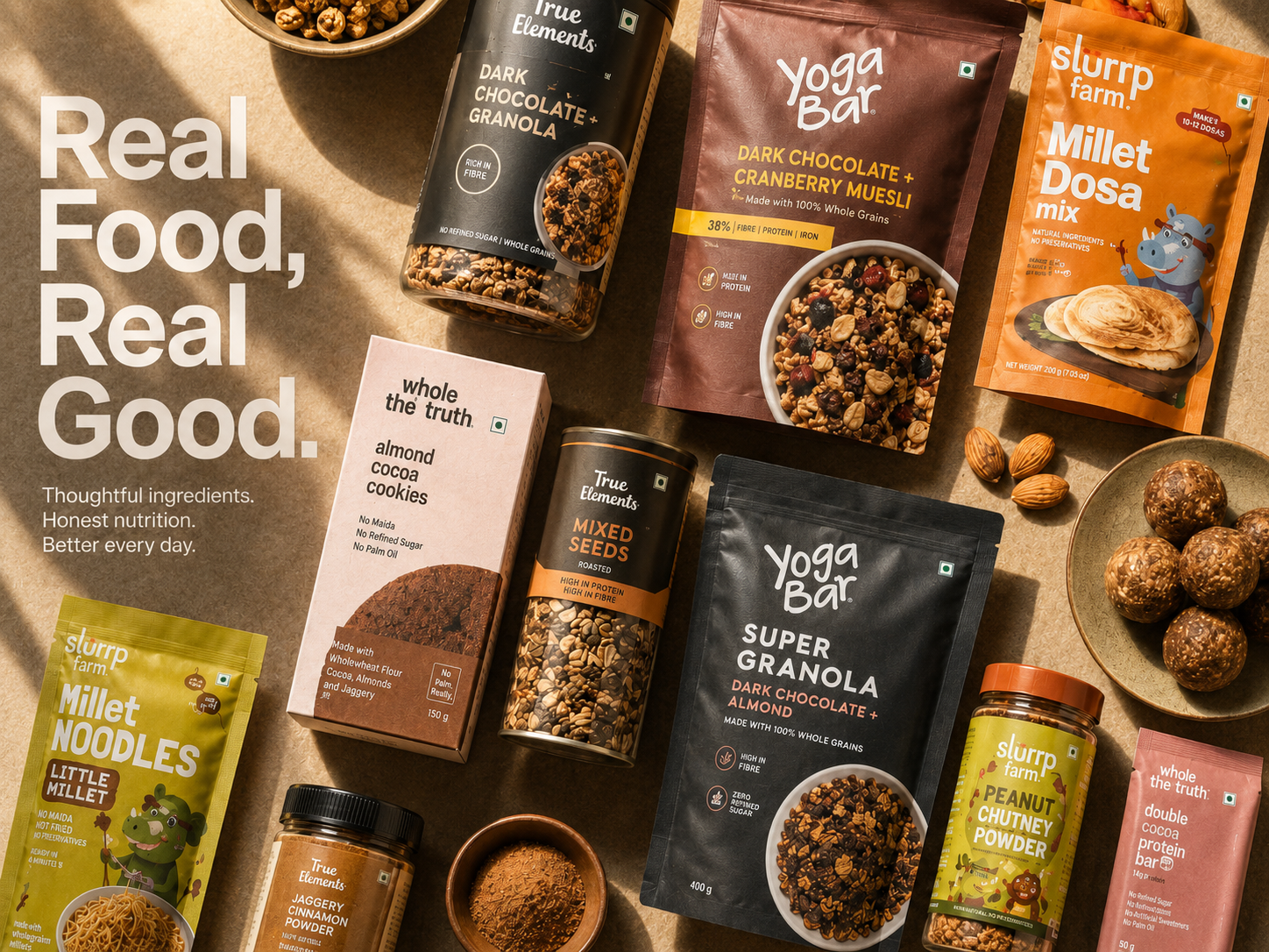
In the unboxing context, packaging drives the decision to post, share, or refer. Slurrp Farm uses warm illustrative packaging that parents and children find genuinely charming, and it photographs well enough to end up in Instagram reels on its own. That organic shareability is a brand amplifier because it introduces new buyers at zero acquisition cost.
Fix it: Screenshot your packaging at actual marketplace thumbnail size, roughly 80x80 pixels, before you commit to a print run. If your brand name or claim disappears at that size, redesign before you print.
See our guide to how packaging design influences buying decisions for a full breakdown of how packaging mechanics influence purchase decisions at each stage of the journey.
.png)
5. Visual Consistency Across All Touchpoints
This is the trust multiplier that most D2C founders build last and should build first.
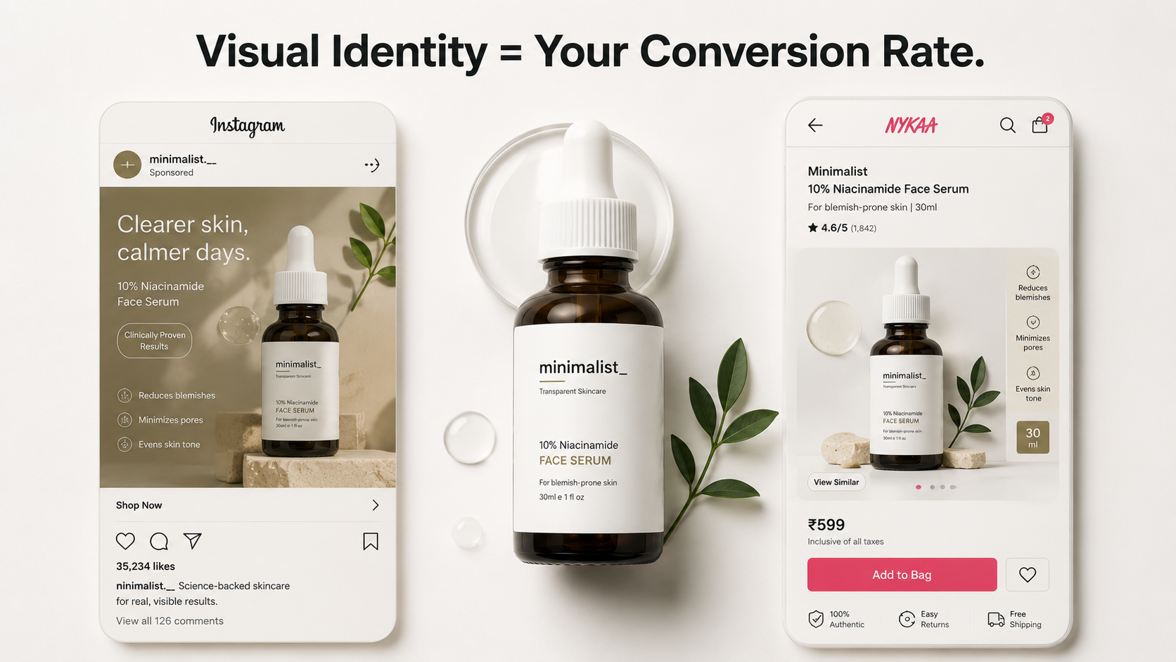
Visual consistency means the consumer sees the same brand, same colour treatment, same typographic hierarchy, same logo presentation, same photographic style, whether they encounter you on Instagram, on Nykaa, in a Swiggy Instamart delivery bag, on your website, or on a shelf at a Nature's Basket store.
When visual identity is consistent, each touchpoint reinforces the previous one. A consumer who saw your Instagram ad, then found your product on Nykaa, then received it in a well-branded box, then used your product every morning for two weeks has had five reinforcing brand interactions.
That cumulative recognition and trust is the mechanism behind repeat purchase, not any single touchpoint converting them on its own. When visual identity is inconsistent, logo different on the website versus the box, colours shifted on social versus packaging, fonts changed between product lines, each touchpoint creates friction instead of reinforcement.
The consumer does not consciously notice the inconsistency, they just feel less certain, and that uncertainty shows up in cart abandonment and lower repeat engagement over time.
Fix it: Line up your Instagram grid, your product listing, and a photo of your packaging side by side today. Flag every element that does not match, and fix the biggest mismatch first.
See our guide to brand consistency across D2C and offline retail for the full framework on keeping one brand system intact as you add channels.
How Indian D2C Brands Win (and Lose) on Visual Identity
The Indian D2C brands with the strongest brand recognition share one characteristic: their visual identity was built as a system before they scaled, not patched together as they grew.
For Example: Pilgrim built a Korean-inspired skincare aesthetic before launching: minimal, ingredient-forward, photography-led. They locked their colour palette, typography, packaging structure, and photography style before their first SKU (stock keeping unit, meaning each individual product variant) went live.
Now across dozens of SKUs, the brand reads as a coherent family because the system was established first.
Yoga Bar built visual identity through its colour-per-flavour packaging system. Each bar variant has a distinct colour while maintaining the same typographic structure and logo placement, which allows range breadth without visual chaos. A consumer buying their second Yoga Bar in a different flavour immediately recognises it as the same brand they trusted before.
Slurrp Farm uses warm illustration and earthy tones to signal clean, honest nutrition for children, a visual promise that their parent-consumer needs to trust before buying food for their child. The packaging signals the brand's values through visual choices that parents associate with craft, care, and quality.
In a category where trust is the primary purchase driver, that kind of visual confidence does work that product claims alone cannot.
What these three brands share is that their visual identity was a strategic decision before it was a design decision. The founders understood what they needed the brand to signal, and built visual systems around that signal instead of around personal aesthetic preference.
See our guide to branding tips for consumer brands to understand the specific decisions that separate brands that build recognition from brands that just look nice.
The Conversion Gaps Most D2C Founders Miss
Most D2C founders focus on the product page when they think about conversion. The real gaps in visual identity appear in four places they are not looking.
The social-to-site gap.
A founder runs a sharp Instagram ad with strong visual identity. The consumer clicks through to a website that looks like it was built by a different brand. That visual disconnect between ad and landing page is one of the most common sources of D2C bounce behaviour, because a mismatch between the ad that earned the click and the page that should close the sale breaks the trust built in the first step.
The packaging-to-product gap.
A product arrives in premium-looking shipping. The consumer opens it and finds a product with a label that does not match the quality signal of the outer packaging, and the mismatch registers immediately. That gap undermines the repeat purchase because the brand has not delivered on the visual promise it made at the marketing stage.
The range-extension gap.
A D2C brand launches its first SKU with a coherent visual identity, then launches two more SKUs six months later with slightly different typography, a shifted colour palette, and a new design direction.
The original identity does not stretch, so the new SKUs look like they belong to a different brand. The consumer does not recognise the family connection, and this breaks the cumulative trust-building that drives repeat purchase.
The marketplace asset gap.
A brand maintains consistent packaging and website design but uses different image styles, backgrounds, and cropping conventions across Amazon, Nykaa, Blinkit, and Zepto. Each marketplace listing looks like it was prepared independently, which, for many D2C brands, it was.
A consumer who discovers the brand on Nykaa and later finds it on Blinkit may not immediately recognise it as the same brand if the visual presentation differs significantly.
Fix it: Pull up your live listings on Amazon, Nykaa, Blinkit, and Zepto side by side this week. Standardise the background, crop, and image order across all four before your next catalogue update.
See our guide to D2C website design best practices for Indian brands to close the social-to-site gap before it costs you conversions.
How to Audit Your Visual Identity for Conversion
This is a four-step framework any D2C founder can run in an afternoon.
Step 1: The 2-Second Grid Test.
Put your product image into a realistic ecommerce category grid alongside 8 to 10 competitor products. Set a 2-second timer, look away, then look back. Is your product the one your eye went to first? If not, your colour or packaging hierarchy is not working at the scale where browsing decisions happen.
Step 2: The Consistency Walk.
Open your Instagram profile, your Nykaa product page, your website homepage, your latest email header, your WhatsApp commerce assets, and your delivery packaging photo, all at the same time.
Do they look like they belong to the same brand? Note every element that does not match: font weight, colour tone, logo size, photography style, background treatment, including marketplace listings across Amazon, Blinkit, and Zepto.
Step 3: The Thumbnail Test.
Shrink your packaging image to 80x80 pixels. Three things should still be legible: your brand name, your dominant colour, and one clear product claim. If any of these disappear at thumbnail scale, your packaging is not optimised for digital retail.
Step 4: The Trust Tier Test.
Show your product page to three people outside your team for 5 seconds each, then ask one question: "What price do you think this product costs?" If the perceived tier lands below your intended positioning, your visual identity is not signalling the right value tier. That gap is a brand design problem, not a pricing problem.
If your audit reveals gaps across more than two of these four tests, your visual identity needs a system rebuild, not a refresh. A refresh changes colours and fonts. A rebuild creates a coherent brand system that works consistently across every touchpoint.
.png)
See our guide to how to build a memorable D2C brand for the full framework on building a brand system that holds up across product ranges, retail formats, and two-year growth cycles.
.png)