.png)





How to Create Instagrammable Packaging: 6 Design Principles That Make Products Go Viral
Instagrammable packaging is packaging that makes someone reach for their phone before they reach for the product. It is not a style, it is a design outcome, one that follows from a set of specific decisions made before a single file goes to the printer.
Most D2C (direct-to-consumer, meaning a brand selling straight to shoppers rather than through a separate retailer) founders approach it backwards: they try to make their existing packaging look good for photography, rather than designing for photography from the start.
Packaging that gets shared organically reduces your customer acquisition cost (CAC, what it costs to win one new customer) every time a buyer posts it without being asked.
An unboxing experience that feels considered rather than functional gives a returning customer a reason to remember the brand positively, which feeds directly into repeat purchase rate, whether the product is a skincare set, a coffee subscription box, or a snack hamper.
This guide lays out the six decisions that create packaging worth sharing, in order.
What Makes Packaging Instagrammable?
Instagrammable packaging consistently does three things, regardless of category or aesthetic.
Visibility: It reads clearly at a 6-inch thumbnail (the small image size a product shows in a scrolling app or feed), with a dominant colour, a legible brand mark, and a visual hierarchy that does not collapse when the image is small.
If the packaging cannot be identified on a phone screen, it will not stop a scroll.
Delight: It contains at least one deliberate moment that breaks the routine of opening a package, such as an inside lid print, an unexpected texture, or a reveal the buyer did not anticipate. Delight is what converts an opening into a post.
Shareability: It has a visual hierarchy and a material quality that hold up under a camera without requiring a controlled studio setup. Shareable packaging photographs well in a bedroom or a kitchen, not just in a professional flat lay.
None of these happen by accident. Each comes from a design decision made upstream, before the brief reaches a printer.
A quick summary of what the six steps cover:
Understanding how packaging design influences buying decisions is the foundation before any of these visual choices are locked in.
.png)
Read through the six-step table above and identify which step your current packaging skips entirely, since that is usually the fastest fix.
Step 1: Design for the 6-Inch Screen First
The first place most Indian D2C buyers encounter your packaging is a 6-inch phone screen, on Nykaa, Amazon, Blinkit, or an Instagram Reels frame. At that size, a cluttered label becomes a grey blur, a subtle colour palette disappears, and a beautiful typographic detail becomes invisible.
Designing for the thumbnail means making at least one of the following true at small scale: your colour dominates the frame, your logo is legible, or your structural silhouette is distinctive. All three at once is better.
The brands that win at thumbnail are not always the ones with the most intricate design; they are the ones with the most disciplined restraint, using one hero colour, one clear typeface, and one legible claim.
Mamaearth's shift toward cleaner, ingredient-forward packaging with a dominant white-and-green system is a good example: every SKU in the range reads as a coherent system at thumbnail even when you cannot make out a single word.
Thumbnail Test Checklist: run this before production sign-off:
- Can you read the brand name at 150px width on an actual phone screen?
- Is the primary colour still recognisable and distinct from competitor products in a grid view?
- Can the product category be understood instantly without reading any text?
- Is there one dominant visual element, not three competing ones, that the eye goes to first?
- At 80px (Blinkit/Zepto tile size), does the colour block still stand out?
If any of these fail, the design needs adjustment before print. Discovering thumbnail failures on a live listing is discovering them after conversion has already been affected.
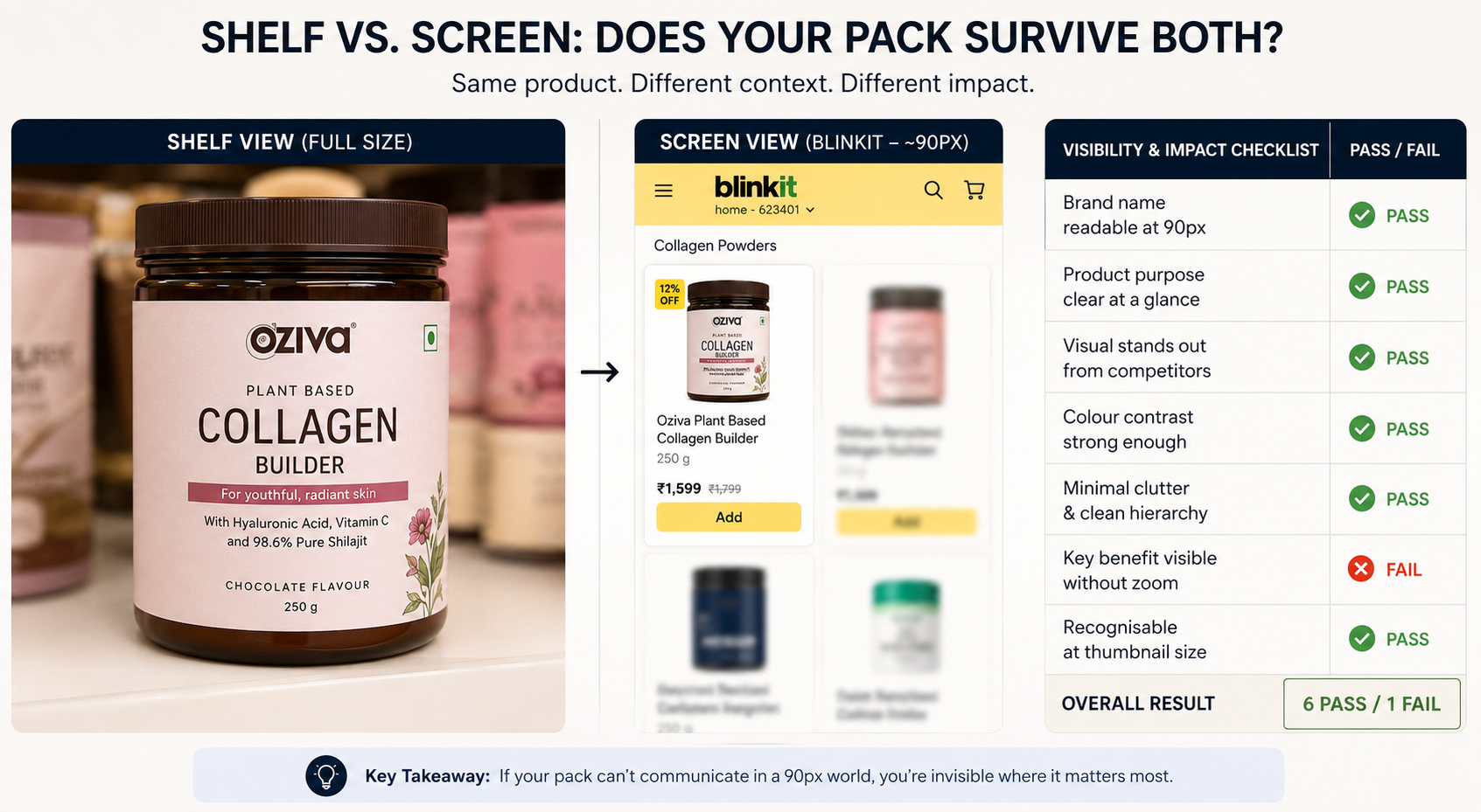
See our guide to consumer psychology in packaging design for the full breakdown of how visual processing works at small scale.
Run the five-point checklist above on your current packaging today, on an actual phone screen rather than a monitor, before assuming it passes.
Step 2: Build a Hero Moment Into the Structure
The biggest mistake D2C founders make when trying to create shareable packaging is treating the outside of the box as the entire canvas.
The hero moment, the thing that makes someone want to show it to someone else, almost always happens at the transition: opening the lid, peeling back a layer, revealing an inside print, or lifting a product from a custom-cut insert.
A framework for building hero moments:
- Reveal: something hidden becomes visible only when the pack is opened, such as an inside lid message, a base print, or a colour that only appears when the outer layer is removed
- Personalisation: a handwritten-style note, a name callout, or a message that feels addressed to the buyer rather than printed for everyone
- Surprise: something the buyer did not expect from the category, such as a sample, an unexpected insert, or a structural detail that breaks the category convention
- Texture: a finish, material, or surface that the buyer's hand responds to before their eye does
- Story: copy or imagery inside the pack that continues the brand narrative after the purchase decision has been made
.png)
Brand examples across categories:
Wellbeing Nutrition, a supplement brand, built exactly this kind of moment into their packaging: the inside of their box lids carry messaging visible only after the product is opened, so the first person who gets excited about it is the buyer, not the marketing team.
Competitors in the wellness supplement space generally spend their packaging budget on outer-facing shelf appeal, which made Wellbeing Nutrition's inside experience the differentiator.
The Whole Truth, a food brand, uses the inside of its packaging to extend the brand's honesty narrative through plain copy, no marketing language, and the same editorial voice as the front panel, which makes the unboxing feel like a continuation of the brand rather than a change of register.
Apple's retail packaging, while not Indian D2C, remains the most studied example of reveal engineering in consumer products, with deliberate lid resistance and a precise foam reveal designed to be filmed long before unboxing content became a category.
Understanding storytelling through packaging design helps frame what story your hero moment is actually telling, and whether it is consistent with what you have already promised on the outside.
Pick one of the five hero-moment types above and sketch how it would work for your specific product, whether that's a serum, a snack bar, or a coffee bag, before briefing a designer.
Step 3: Colour Is the Fastest Scroll-Stopper You Have
Colour is registered by the brain before shape, before typography, and before any claim on the front of pack. Buyers decide whether a product is worth a second look in under a second, and that decision is almost entirely colour-driven at the scroll stage.
A scroll-stopping colour system does not mean bright or maximalist; it means deliberate and ownable.
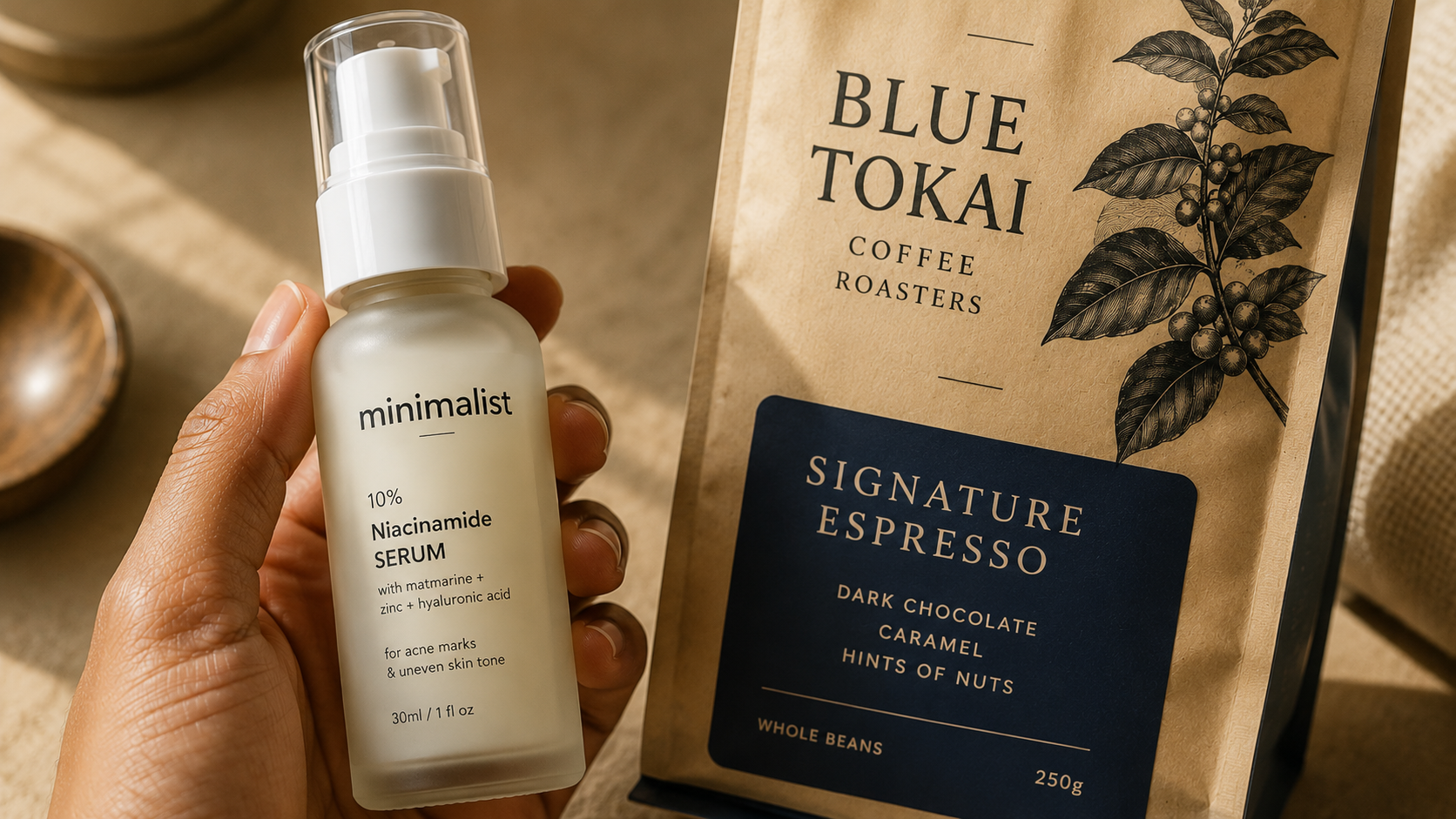
Sugar Cosmetics' saturated jewel-tone palette owns a visual territory that global beauty brands in India do not occupy, while Minimalist's stark, clinical white-with-accent-colour system is the opposite approach but equally ownable, since no other brand in Indian skincare leaned into that level of laboratory restraint to the same degree.
The trap to avoid is the category default: beige-and-white for "natural," navy-and-gold for "premium," matte black for "luxury." All three are so common across Indian D2C, in beauty, food, and beverage alike, that they have stopped signalling anything distinctive.
Quick colour audit: run this before finalising your palette:
- What colours dominate the top 10 products in your category on Amazon or Nykaa?
- What colours are so overused they have become invisible, the category wallpaper?
- What colour territory does no significant competitor in your category currently own?
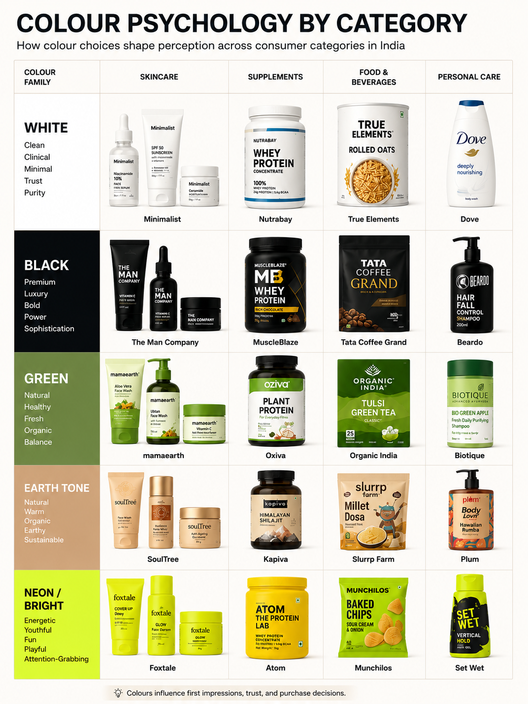
The palette that performs best on Instagram is the one no one in your specific category is using yet, regardless of whether that category is skincare, snacking, or beverages. The question is not "what looks good" but "what creates a visible break in the category pattern when placed alongside five competitor products."
Run the three-question colour audit above against your actual category on Amazon or Nykaa before locking your palette.
Step 4: Use Typography That Performs at Two Scales
Typography is the most underdeveloped section of most packaging briefs, and the one with the most direct effect on both shareability and legibility in commercial contexts.
Beauty, food, and wellness packaging all have to carry a lot of mandatory text, including ingredient lists, usage instructions, and compliance declarations, on a surface that is probably not larger than your hand.
The typography decision is not just aesthetic, it is functional, since a display typeface (a decorative typeface meant for headlines rather than body text) that looks stunning at 48pt in a mockup can become completely unreadable at 7pt on the back panel.
Typography principles for packaging that works at two scales:
Use a maximum of two typefaces. One display face for headlines and front-of-pack hierarchy, one clean, highly legible body face for mandatory and smaller-format text.
These should be typographically compatible but clearly distinct in weight and visual character, since more than two typefaces adds noise and weakens brand recognition, particularly at thumbnail scale where only the dominant typographic element survives.
Build a clear hierarchy. The brand name or primary claim should be the visually dominant element, in the heaviest weight, the largest size, the highest contrast position. If everything on the front panel is given similar visual weight, the hierarchy is accidental and the eye does not know where to go first.
Avoid thin weights for anything that needs to be legible. Light and ExtraLight type weights disappear at thumbnail scale and become illegible at small print sizes, so any typeface used for primary claims or the brand name should be set at Medium weight or heavier.
Test every typeface at thumbnail size before finalising. Export the front panel at 150px width and look at it on a phone. If the brand name requires effort to read, the typeface is not working at the scale where most discovery happens.
Avoid decorative scripts for primary claims. Script and hand-lettered typefaces have low x-heights (the height of lowercase letters relative to capitals) and thin strokes that collapse at small sizes, so they work best as accent elements over a legible primary typeface, not as the carrier of the brand name.
Minimum legibility threshold for body copy: 7pt. Anything below this for mandatory declarations, ingredient lists, or usage instructions creates compliance presentation issues and frustrates label-reading buyers who are checking ingredients before purchase.
See our guide to best fonts for packaging design for a full breakdown of typeface categories, pairing frameworks, and legibility thresholds by packaging context.
Apply the two-typeface rule and the 7pt minimum to your current label proof before sign-off, regardless of category.
Step 5: Material and Texture Create Content Without Effort
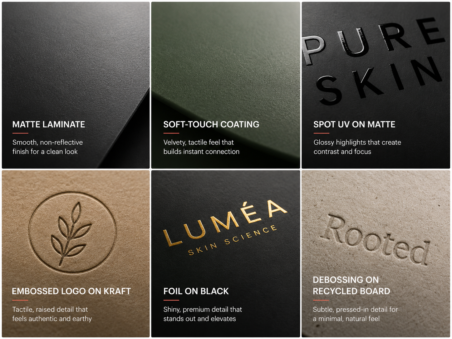
The reason soft-touch matte finishes dominate premium D2C unboxing content is not aesthetics, it is tactility. A buyer who picks up a matte-finished box instinctively photographs it because it feels unusual, different from the glossy packaging that makes up the majority of what is on the average shelf, and texture triggers touch while touch triggers photography.
Finishes that consistently generate content:
- Soft-touch matte laminate: velvety, tactile, signals restraint
- Embossed logos or patterns: raised detail pressed into the surface, creating a tactile and visual contrast that reads as craft
- Spot UV on matte base: a glossy varnish applied to selected areas of a matte surface, creating a contrast buyers notice and photograph
- Foil accents used as spot finish: not allover coverage, but a precise metallic element that catches light selectively
- Debossing: a pressed-in detail (the inverse of embossing) that feels considered and permanent, commonly used in premium D2C packaging for brand marks and closure elements
- Recycled-textured kraft: the visible fibre texture signals sustainability and honesty in a way gloss cannot
This is also where material choice directly shapes the kind of content your packaging generates. A kraft-and-minimal-print box generates a very different Instagram post than a high-gloss jewel-toned box, even if both contain the same product, whether that's a coffee bag or a serum.
The commercial case for material investment:
Beyond content generation, material and finish decisions have direct business outcomes. A tactile, considered finish increases perceived product value before the product is used, which supports higher pricing and reduces buyer hesitation at the point of purchase.
Packaging that feels gift-worthy increases giftability, which extends the distribution occasion beyond self-purchase, and a finish that photographs well generates organic content that reduces paid CAC over time.
See our guide to best packaging materials for premium brands for the cost and perceived-value tradeoffs of each finish option.
Choose material the same way you choose colour, for what you want the experience to feel like, not just look like, and shortlist one finish from the list above before requesting printer quotes.
Step 6: Make the Unboxing a Sequence, Not a Single Reveal
An unboxing video that lasts 45 seconds generates more platform reach than a product photo. The brands with the most consistently shared unboxing content have built their packaging as a sequence of moments, not a single reveal, where each transition gives the camera a new frame.
The 5-moment unboxing framework:
1. Outer box: the first impression before anything is opened. Colour, brand mark, texture. This is the thumbnail moment made physical.
2. Opening action: the experience of opening itself. Lid resistance, magnetic closure, tear-strip, or lift-lid each create a different sensory moment that signals the quality of what is inside before anything is visible.
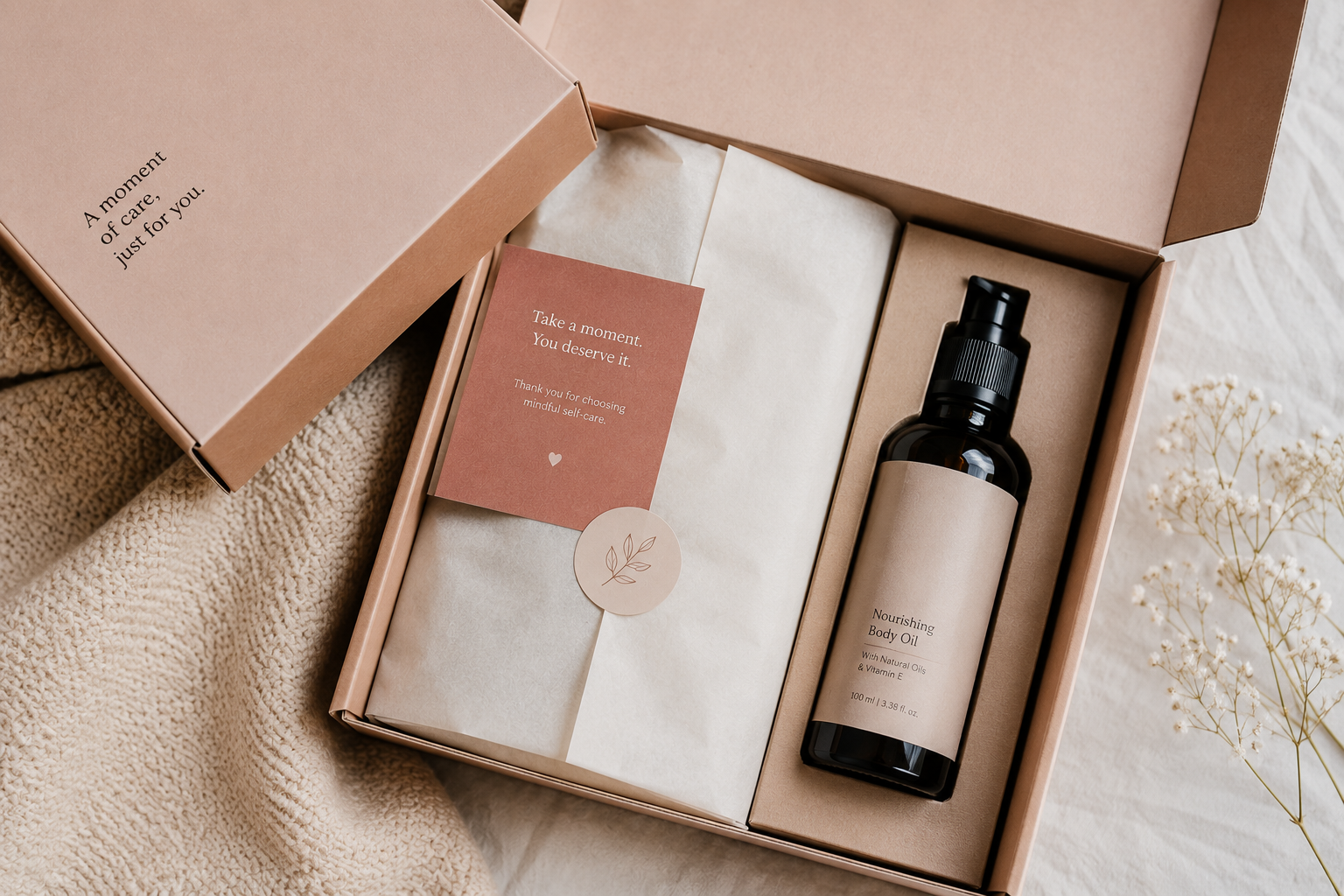
3. Inner reveal: the inside lid, the tissue layer, the inner liner. This is where the hero moment from Step 2 lives, and the first thing visible when the pack opens should be deliberate, not functional filler.
4. Brand story: a card, a note, copy printed inside the box, or a message on the inner liner that continues the brand narrative after the purchase. This is what gives the unboxing emotional texture beyond visual quality.
5. Product moment: the product itself in context, nested in a custom insert, wrapped in tissue, or presented in a way that matches the price tier and positioning. The product reveal should feel like the final frame of a sequence, not the only frame.
A four-to-five moment sequence does not require custom structural molds. A single-colour inside box liner, a sticker seal on tissue paper, and a handwritten-style thank-you card on the outer box create a four-moment sequence through print and packaging specification decisions alone, applicable whether you're shipping a skincare set, a coffee subscription, or a snack box.
See our guide on how packaging impacts ecommerce conversions: the same sequence that creates a shareable video also creates the first-impression moment that determines whether a customer reorders.
For structural options that create the most sequence potential per unit cost, see our ecommerce packaging ideas for startups guide.
Map your current unboxing against the five-moment framework above and identify which moments are missing before specifying any new print element.
What Instagrammable Packaging Won't Fix
Instagrammable packaging gets a product shared before it is used. What it cannot do is fix a product that does not perform, a price point that does not survive a second look, or a brand story that is inconsistent across every other channel.
Specifically, shareable packaging will not fix:
- Poor product-market fit. A beautifully packaged product that does not solve a real problem will generate unboxing content and one-star reviews simultaneously.
- Weak positioning. If the brand story is unclear, with the packaging saying one thing, the website another, and the ads a third, the unboxing delight does not compound into brand trust.
- Bad reviews. A buyer who posts their unboxing and then returns the product has generated content that actively undercuts the brand.
- Wrong audience targeting. Packaging designed to go viral with a Gen Z beauty audience will not perform for an older wellness buyer looking for clinical credibility, even if the design is excellent.
Brands that win long-term on packaging-driven content are the ones where the packaging, the product, and the brand story are all saying the same thing at the same time, across categories from food to beverage to personal care.
For a practical framework on how to align all three before a production run, see how to design packaging for beauty brands.
Run the four-point diagnostic above on your brand honestly before investing further in unboxing design, since a strong unboxing cannot offset a weak answer to any of these.
When to Bring In a Packaging Design Partner
Most founders can audit their own packaging for thumbnail legibility and unboxing sequence potential without external help. Building a colour system that is genuinely ownable, specifying finishes that work at your unit cost, and producing print-ready files that match the mock-up is where most early teams lose the most time.
It is worth bringing in a packaging partner when:
- You are managing multiple SKUs and need a visual system that extends consistently across the range without a full redesign each time
- You are entering retail and the packaging needs to perform for a buyer evaluation, not just an end consumer
- You are launching a product at a higher price tier where the material and finish decisions need to match a higher standard of production
- Your production run value has grown to the point where the cost of getting it wrong is significantly higher than the cost of getting specialist help
- Compliance complexity is increasing, with multiple markets, imported formulations, or claims that need substantiation
If you are designing or redesigning packaging for a D2C brand and need it to perform on screen as well as shelf, our packaging design for ecommerce brands service is built around exactly these requirements.
If two or more of the five conditions above apply to your brand right now, that is a reasonable point to bring in a specialist rather than continuing the audit solo.