.png)




Best Fonts for Packaging Design: What Works on Shelf, Screen, and Quick Commerce
A font is read before it is read. A shopper registers the weight, the spacing, and the shape of the type on a label before they process a single word of the claim it carries.
This is backed by typography research. A typeface's letterforms (the actual shapes of each letter), stroke weight (how thick or thin the lines of a letter are), and spacing trigger emotional responses faster than the words themselves. That first impression decides whether a product feels premium or ordinary, clinical or warm, trustworthy or careless.
For Indian D2C brands fighting for attention on a BigBasket listing, a D-Mart shelf, or a Blinkit thumbnail (the small square image a product shows in a scrolling app grid), font choice is not a finishing touch. It is one of the fastest signals a shopper processes. It is also one of the most direct drivers of trust, perceived quality, and conversion at the point of purchase.
This guide covers how to think about packaging typography across skincare, food and beverage, and coffee. It explains which fonts perform and why, and the mistakes that quietly undercut otherwise strong packaging.
Why Font Choice Is a Commercial Decision
Typography on packaging does three jobs at once.
Legibility under pressure. A shopper has 2 to 3 seconds at shelf and even less at thumbnail scale. The font must be readable instantly, not just attractively designed.
Category and price signalling. Certain typefaces carry built-in associations. A thin modern sans-serif (a typeface without small decorative strokes at the end of letters) reads clinical and upscale. A rounded, friendly typeface reads approachable and everyday. Shoppers register this before reading any words, which means typography shapes the perceived price tier of a product before the actual price is seen.
Brand differentiation. In a shelf section where every competitor uses the same default sans-serif, a distinctive but legible typeface becomes a recognition asset on its own. Typography is often the first brand element a returning shopper recognises, ahead of the logo and the colour palette.
A coffee bag, a hydration drink, and a skincare serum can each use the wrong typeface and read a tier below their actual quality. The right typeface lets a mid-tier product borrow the perceptual weight of a pricier shelf neighbour, regardless of category.
What to do next: Before reading further, name your product's intended price tier in one phrase (value, mid-market, or premium) and check whether your current typeface matches that tier or contradicts it.
The 6 Best Font Categories for Packaging Design
1. Geometric Sans-Serif
What it signals: Clinical precision, modern confidence, scientific credibility.
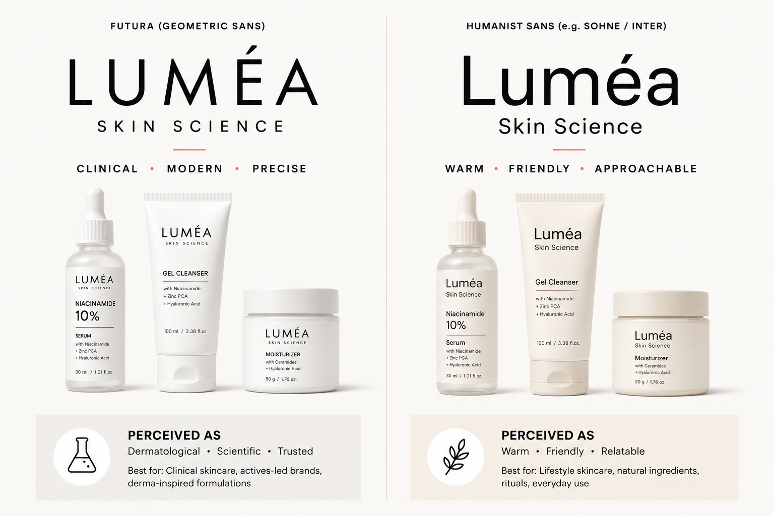
Geometric sans-serifs use clean, consistent stroke widths and minimal decoration. This makes them the default choice for active skincare, supplements, and science-led wellness brands. They also hold up across functional beverage labels and protein snack packs, where a clinical, ingredient-led tone matters.
Popular examples: Futura, Helvetica Neue, Inter, Aktiv Grotesk.
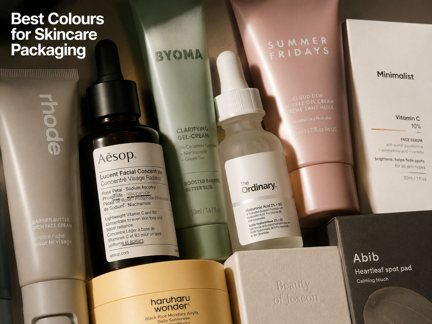
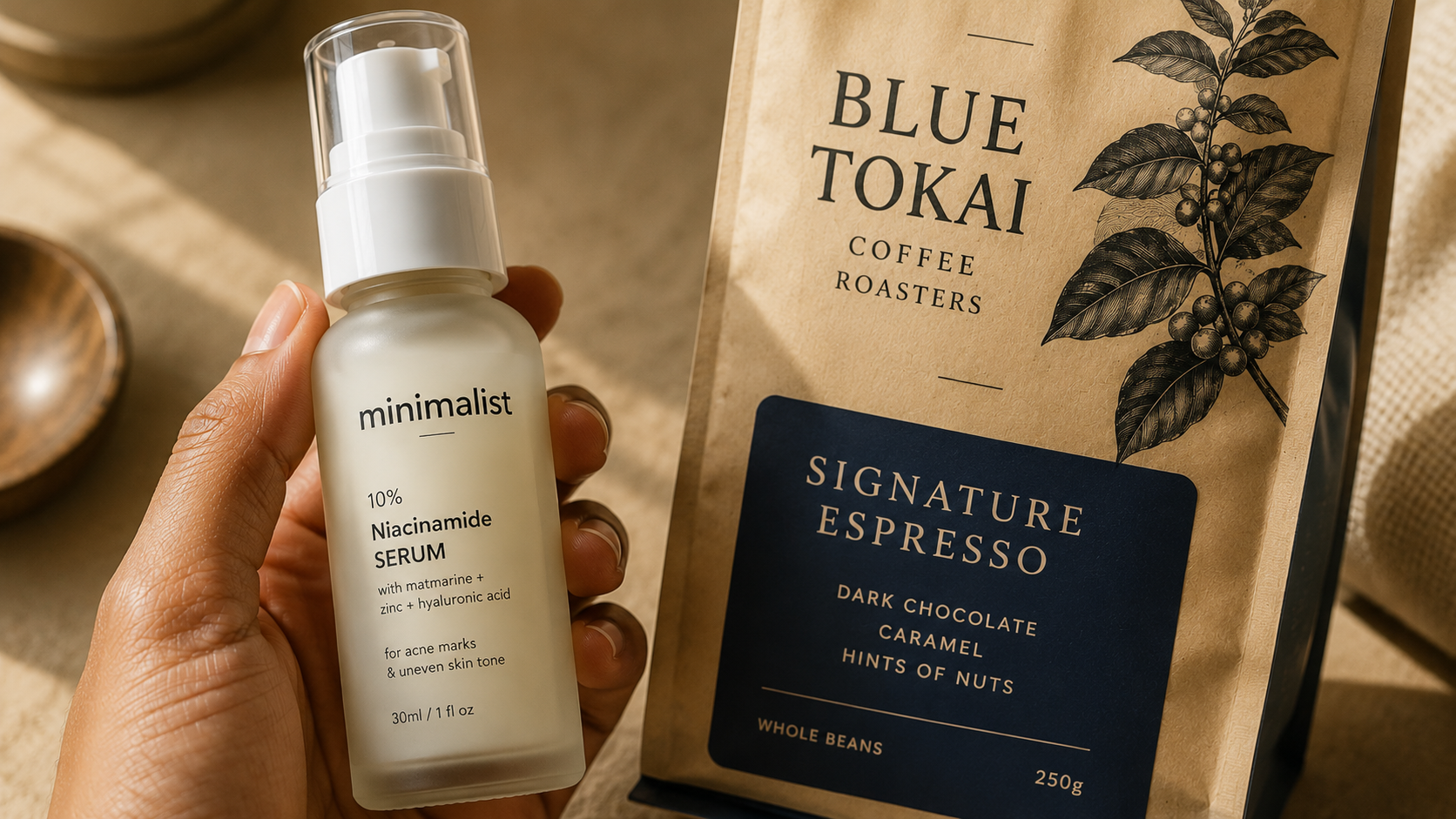
Indian brand example: Minimalist builds its packaging language around a geometric sans-serif used at multiple weights. The ingredient percentage appears in heavy bold type next to lighter supporting text, creating a hierarchy that reads instantly, even at thumbnail scale.
A note on overuse: Geometric sans-serifs have become so common in Indian D2C skincare that they no longer function as a differentiator there. If your packaging looks like three competitors on the same Nykaa or BigBasket listing, a geometric sans-serif alone will not fix that. It needs colour, hierarchy, or weight contrast working alongside it.
What to do next: If you're in skincare, supplements, or functional beverages and considering a geometric sans-serif, list two design elements (colour, layout, or weight contrast) that will separate your label from category default before you finalise it.
2. Humanist Sans-Serif
What it signals: Approachable warmth without losing modern credibility.
Geometric sans-serifs are built on strict, almost mathematical shapes: circles, uniform strokes, mechanical consistency. Humanist sans-serifs introduce slight variation in stroke width and more organic letterforms, so they feel hand-drawn rather than constructed. Geometric reads precise and cold; humanist reads precise and warm.
Popular examples: Inter, Source Sans, Calibri, Open Sans.
Indian brand examples: Plum Goodness uses humanist sans-serif type across its vegan skincare range, paired with sage green and natural imagery. The font softens the clinical edge a pure geometric system would carry. Several Indian clean-label snack and functional beverage brands use the same category of typeface to signal health-conscious quality without a pharmacy-adjacent coldness.
What to do next: If your product needs to feel trustworthy but not sterile (gentle skincare, hydration, clean-label food), shortlist one humanist sans-serif and test it against your current font in a side-by-side mockup.
3. Modern Serif
What it signals: Heritage, editorial sophistication, premium positioning without ornamentation.
A serif is a typeface with small decorative strokes at the ends of letters. Modern serifs use high-contrast strokes (thick in some places, thin in others) and refined detailing that signal craftsmanship. They work strongly for premium beauty, fragrance, and Ayurvedic or heritage-led food and beverage brands.
Popular examples: Playfair Display, Canela, Freight, Tiempos.
Indian brand example: Forest Essentials uses refined serif type across its packaging to reinforce a heritage Ayurvedic positioning. The serif communicates established craft, standing apart from the geometric sans-serif language used by newer D2C skincare brands.
The serif comeback: Modern serifs are returning across premium Indian D2C categories, not just beauty. Premium cold-pressed oil brands, small-batch honey producers, and craft coffee roasters increasingly use editorial serif type to signal a considered, artisanal quality that geometric sans-serifs have stopped communicating effectively in a crowded field.
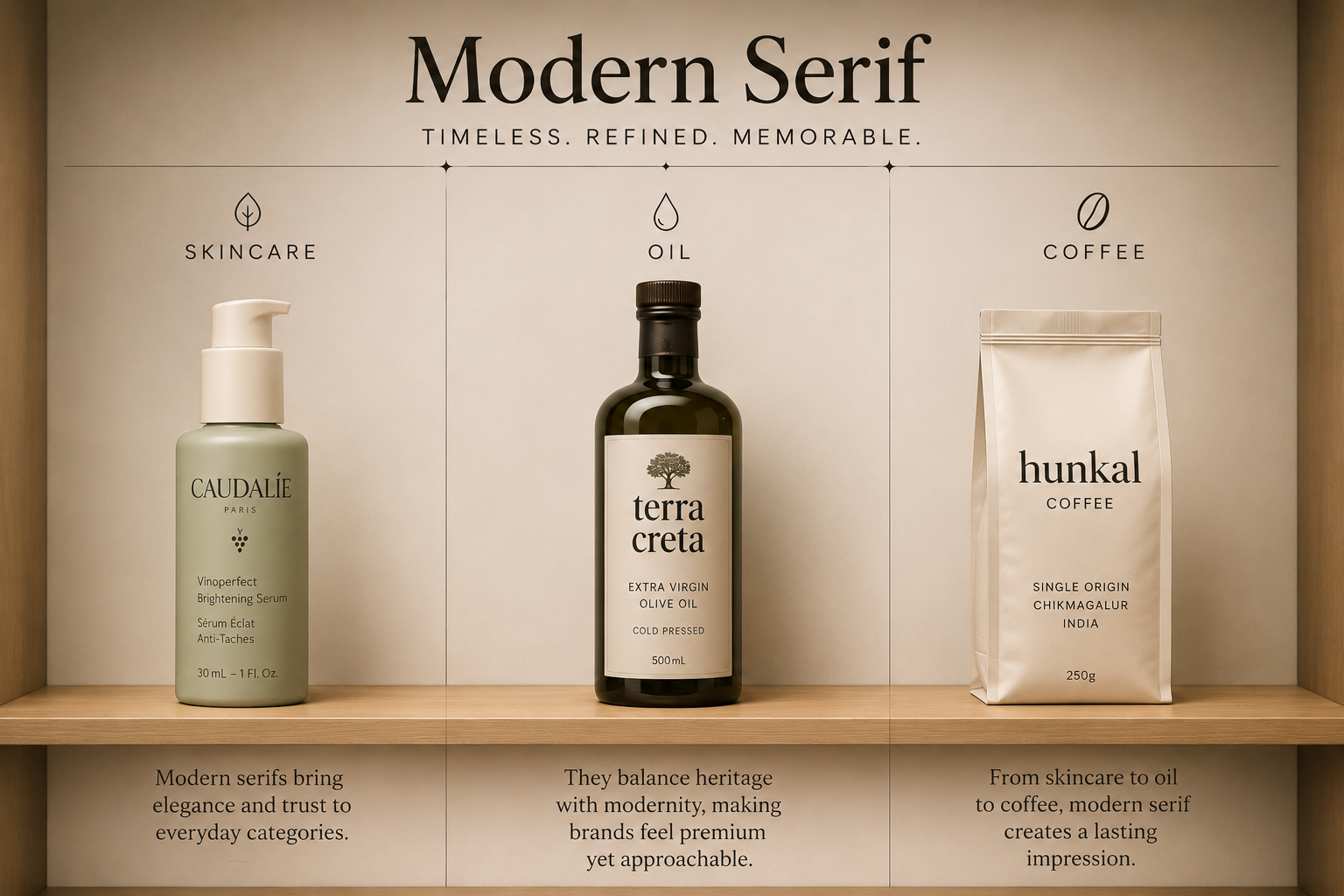
What to do next: If your category has been dominated by the same clinical sans-serif for years, test a modern serif for your brand name only and keep functional copy in a clean sans-serif, to see whether it earns more attention on shelf.
4. Bold Display Sans-Serif
What it signals: Energy, confidence, Gen Z relevance.
Bold display sans-serifs use heavy, often condensed letterforms built to dominate the visual field rather than to whisper. They suit categories where standing out matters more than projecting clinical restraint: beverages, snacking, and youth-skewing personal care.
Popular examples: Druk, Anton, Archivo Black, Gotham Black.
Indian brand example: MCaffeine pairs a bold display sans-serif with neon background colour for maximum visual impact at every scale. The heavy weight survives compression down to an 80 to 100 pixel Blinkit thumbnail, where a lighter typeface would not.
Why bold display fonts win in quick commerce: At 80 to 100 pixels, most typographic detail disappears. Thin strokes and tight letter spacing collapse into noise. Bold display sans-serifs survive this because their stroke weight and contrast remain readable even at a fraction of their original size.
When this style becomes too aggressive: Applied to premium skincare, clinical supplements, or any product positioned around calm and restraint, the same display weight can read as visually loud and undercut that positioning. The typeface needs to match the category's expected energy level, not the founder's personal preference for boldness.
What to do next: Export your current label's brand name at 100x100 pixels. If it blurs into the background, a bold display sans-serif (or a heavier weight of your current font) is worth testing before print.
5. Slab Serif
What it signals: Sturdy reliability, craft, a slightly retro confidence.
Slab serifs use thick, block-like serifs that feel grounded and substantial. They suggest authenticity and an unpretentious, handcrafted quality, which makes them a strong fit for artisanal food brands, coffee, and personal care lines that want to feel honest rather than high-tech.
Popular examples: Rockwell, Archer, Roboto Slab.
Indian brand example: Raw Pressery and several Indian craft coffee and small-batch snack brands use slab serif type to signal small-batch authenticity, standing apart from the geometric sans-serif language used by larger, more clinical competitors in adjacent categories.
When slab serif outperforms modern serif: Modern serifs signal heritage and editorial polish, but their fine strokes also read as formal. Slab serifs carry the same heritage and craft signal without that formality. Choose slab serif when the brand story is honest and handmade. Choose modern serif when the brand story is sophisticated and heritage-led.
What to do next: Write one sentence describing your brand's origin story. If it centers on a person, a kitchen, or a single batch, lean slab serif. If it centers on tradition, ingredients, or lineage, lean modern serif.
6. Hand-Lettered or Script Accent
What it signals: Personal touch, indulgence, gifting context.
Script fonts (typefaces styled to look like cursive handwriting) should almost always be used as an accent rather than the primary typeface, since they sacrifice legibility at small scale. The contexts where script genuinely helps are narrow: gifting SKUs, where a handwritten feel reads as personal; artisanal products, where hand-lettering suggests a maker's signature; and festive or limited-edition packaging, where the occasion justifies a warmer departure from the standard brand system.
Popular examples: custom hand lettering, Caveat, Pacifico (used cautiously).
The rule that applies in every context: Script should rarely carry the brand name alone on packaging. If it cannot be read at 100 pixels, it should not be the only thing carrying the brand name. The script works as a layer on top of a legible primary typeface, never as a replacement for it.
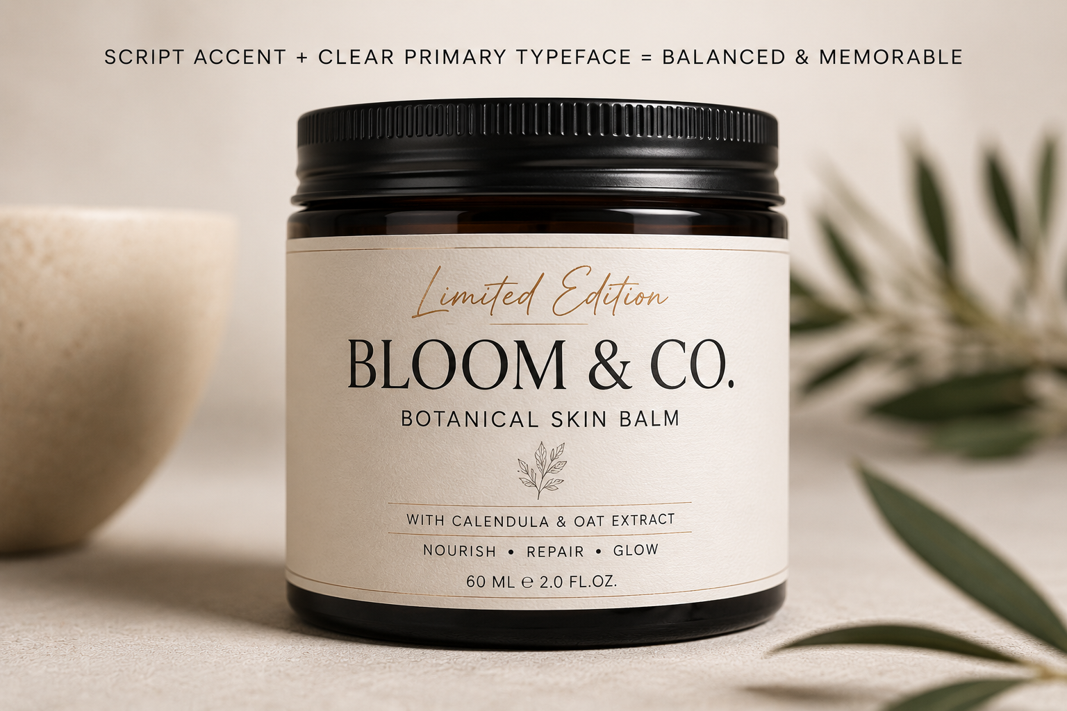
What to do next: If you're using script anywhere on the front panel, confirm the brand name itself is also set in a legible primary typeface elsewhere on the same panel.
How to Pair Fonts on Packaging
Individual font choices are only half the decision. The other half is how two typefaces work together across a packaging system.
The principle behind effective font pairing is contrast with harmony. Two typefaces that are too similar create monotony without a clear hierarchy. Two that are too different create visual conflict. The best pairings combine typefaces from different categories that share an underlying sensibility.
Geometric Sans-Serif + Serif Accent. The geometric sans-serif carries the brand name and headline claim. A refined serif handles secondary text or taglines, adding warmth to what would otherwise feel purely functional. This works for premium skincare and supplement brands signalling both science and craft. Example: Helvetica Neue for the active ingredient percentage, Playfair Display for the brand name beneath it.
Serif + Clean Sans. A serif leads the packaging, carrying the brand name and the heritage signal. A clean sans-serif handles ingredient lists and compliance text. Common in premium beauty, Ayurvedic brands, and heritage food products. Example: Canela for the brand name, Inter for body copy.
Bold Display Sans + Functional Sans. The display typeface dominates the front panel and earns the shelf moment. A lighter functional sans handles supporting information so the display type doesn't overwhelm the label. Most effective in beverage, snacking, and Gen Z personal care. Example: Druk for the brand name, Open Sans for usage copy.
The pairing mistake to avoid: Using two typefaces from the same broad category, such as two geometric sans-serifs, without meaningful weight or scale contrast. The result reads as an unresolved decision. When in doubt, vary the category before varying the weight.
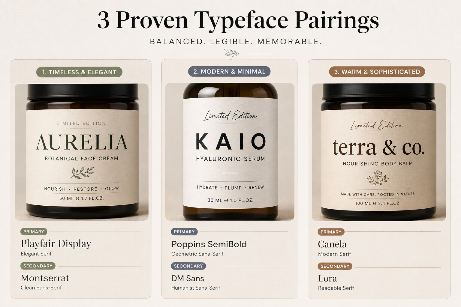
What to do next: Pick one of the three pairing frameworks above that matches your category, then test your current secondary typeface against the recommended pairing to check for category overlap.
Packaging Typography for Quick Commerce: Fonts That Survive Blinkit and Zepto
Quick commerce platforms shrink your product to an 80 to 100 pixel thumbnail in a scrolling grid. The buyer is on a phone, often moving, often distracted, with less than two seconds to decide if your product is worth a tap. Typographic choices that work at full shelf scale, such as thin weights or tight spacing, fail completely at this size.
Minimum stroke weight. At 80 to 100 pixels, thin strokes disappear. Any typeface below a Medium or SemiBold weight for the brand name will become illegible at thumbnail scale.
Letter spacing. Tight letter spacing (also called tracking) compresses further at small scale, turning readable words into a blur. Adding 5 to 10 percent extra tracking to the brand name preserves readability without changing how the design looks at full size.
Contrast. Light grey on white or soft beige on cream loses legibility at thumbnail scale. Quick-commerce typography needs dark type on a light ground, or reverse type on a strong colour block. This is a legibility requirement, not a style preference.
The 100-pixel test. Export the front panel at 100x100 pixels and view it on a phone screen. Ask one question: can you read the brand name without effort? If not, the typography is not quick-commerce ready, regardless of how it performs at shelf.
Common quick-commerce typography mistakes:
- Script or hand-lettered brand names that collapse into texture at small scale
- Primary claims set in thin Light or ExtraLight weights
- Multiple lines of small-size copy as the front panel's main element
- Typefaces with low x-height (the height of lowercase letters relative to capital letters), which lose readability faster as size decreases
- No single dominant typographic element for the eye to anchor on
MCaffeine, Minimalist, and Mamaearth all share one typographic trait that helps them perform in quick-commerce grids: a single, heavy-weight, high-contrast brand name or claim that stays readable even when everything else in the thumbnail loses detail.
What to do next: Run the 100-pixel test on your current packaging today. Screenshot it next to two competitors in a grid and note which one your eye lands on first.
The 3 Font Mistakes That Undercut Packaging
Mistake 1: Using more than two typefaces. Every additional typeface adds visual noise and dilutes brand recognition. Use one primary typeface for the brand name and headline claim, and one secondary typeface, often a different weight of the same family, for supporting information. When hierarchy feels unclear, increase weight contrast within the existing system rather than adding a third font.
Mistake 2: Choosing a font that fails at thumbnail scale. A typeface that looks elegant in a large product photo can collapse into illegible noise at an 80 to 100 pixel thumbnail. This is a conversion problem, not an aesthetic one. Test every font choice at that scale, on the actual platform, before it goes to print.
Mistake 3: Letting font choice fight the brand's positioning. A script font on a clinical active-ingredient serum sends a mixed signal. A heavy condensed display font on a delicate hydration product does the same in reverse. Premium-coded typography on a value-tier snack pack creates an expectation the price point can't meet, and playful, rounded type on a premium-tier serum undercuts the premium signal the rest of the packaging is building. The typeface needs to match the same promise the formulation and price tier are making.
What to do next: Check your current packaging against these three mistakes in order. If you find even one, that's the next fix to prioritise before any redesign.
How to Choose the Right Font for Your Packaging
Before finalising a typeface, work through these checks.
What single feeling should the brand name trigger in under one second? Clinical trust, indulgent warmth, bold energy, and heritage craft each point toward a different font category. If you cannot name the feeling in one word, the brief isn't clear enough to make a sound font decision.
Does it survive the thumbnail test? Export the label at 100x100 pixels. This is a non-negotiable check, not an optional one.
Does it hold up across the full SKU range? A typeface that works on one bottle but becomes awkward on a smaller pouch or a taller jar will create inconsistency as the product line grows. Test it across every format you sell now and any planned in the next 12 months.
Is it licensed for commercial packaging use? Many premium typefaces require a separate commercial or print licence beyond a standard desktop licence. Confirm this before committing to a typeface that will be reproduced at scale.
Can a shopper identify your brand in under one second? Remove the logo from the label and ask whether the typographic style alone communicates the brand. If not, the typography is functional but not yet a recognition asset.
How does your typography compare against competitors on shelf? Place your shortlisted design in a grid alongside five competitor products from your category, using real screenshots. Does your system create a visible distinction, or does it blend in?
What to do next: Run your shortlisted typeface through all six checks before sending files to print. Any unchecked box is a reason to revisit the choice, not a reason to ignore it.
If you want a second opinion on whether your current typography matches your actual positioning and price tier, see Jellypop's packaging design page for how we approach this during a brand audit.
Packaging Typography Trends for 2026
Typography in Indian D2C packaging is shifting in ways that reflect both global design direction and the specific pressures of quick commerce.
The return of serifs across premium categories. After a decade of geometric sans-serif dominance in skincare and wellness, modern serifs are appearing more often at premium price points across beauty, food, and beverage, as a deliberate departure from the clinical default.
Larger, bolder primary type. Brands launching now are setting primary brand names and claims in heavier weights than five years ago, largely because thumbnail performance has become a commercial requirement rather than a stylistic choice.
Simpler hierarchy with fewer typographic levels. More brands are using a single dominant typographic element, one heavy claim or one clear brand name, and moving supporting information to the back or side panel. This improves both thumbnail performance and shelf clarity.
Quick-commerce-first packaging systems. Some newer Indian D2C brands now design with the Blinkit thumbnail as the primary brief and the physical shelf as secondary, producing bolder colour and heavier type than a shelf-first brief would.
Custom and semi-custom typography becoming more common. As brands scale, more are commissioning custom lettering for brand names rather than relying on off-the-shelf typefaces, since a custom lettermark is harder for competitors to replicate.
What to do next: Pick the one trend above closest to your category and ask whether your current packaging is ahead of it, keeping pace with it, or already behind it.
Most Packaging Typography Is Chosen on Taste Rather Than Shopper Behaviour
A typeface chosen because the founder likes it, without testing it at thumbnail scale or against competitor context, is a commercial risk disguised as a design decision.
Most packaging typography decisions are made on taste rather than shopper behaviour. We help D2C brands across skincare, food and beverage, and coffee build typography systems that improve recognition and stay legible across shelf, ecommerce, and quick commerce. See our packaging design work.