.png)


Common Packaging Design Mistakes Indian D2C Brands Make (And How to Fix Them)
The most common packaging design mistakes aren't just aesthetic slip-ups. They're strategic failures that cost Indian D2C brands shelf placement, online conversions, and repeat customers: and they happen before a single product ships, which is exactly why they're so expensive to fix afterwards.
If your product is great but retailers aren't picking it up, online conversion is low, or repeat purchase has stalled, packaging is one of the first places to look.
Here are 8 packaging mistakes to avoid that show up again and again in Indian D2C, and what to do instead.
Mistake 1: No Packaging Brief: Just a Mood Board and a Reference Brand
"Make it look like this but more premium" isn't a packaging brief. It's a starting point that guarantees endless revision cycles.
A brief that actually produces commercial results needs to cover a few things: who's buying this product and why, where they'll encounter it (shelf, ecommerce, quick commerce, gifting, export), what the competitive landscape looks like and what space is available, what this product stands for (and doesn't), the technical constraints (production specs, FSSAI requirements, materials), budget and timeline, and how many variants exist now and might exist in 12 months.
Without these inputs, a designer makes aesthetic decisions. With them, a designer makes commercial ones: and that difference shows up at retail.
The fix: Before briefing any designer or studio, write a one-page brief answering four questions: who is buying this, where will they find it, what must they understand in three seconds, and what are the non-negotiables on the technical side.
Mistake 2: Designing for a Screen, Not the Real Shelf or Thumbnail
Most designers work in design software at full size on a bright monitor, and most founders approve packaging the same way. Nobody is checking how it actually looks on a BigBasket shelf, a Blinkit listing at 200px wide, or a Nykaa page surrounded by ten competitors.
The result is packaging that looks polished in a PDF and performs poorly in real retail and ecommerce.
A few things that commonly go wrong: gradient backgrounds turn into grey mush at small sizes, delicate decorative fonts disappear at thumbnail scale, and product name hierarchy that only works when someone's standing 30cm away falls apart on a screen.
The fix: Check every design at three scales: physical shelf distance (about 1 metre away), the ecommerce main image on a phone screen, and a thumbnail at roughly 200px wide, as it would appear in a Blinkit grid. If the product name and category aren't immediately readable at thumbnail size, the design isn't finished yet.
See how this plays out in practice in our breakdown of how packaging impacts ecommerce conversions.
Mistake 3: Cluttered Front-of-Pack With No Clear Hierarchy
This is one of the most common packaging design mistakes for D2C brands at the seed stage. The founder wants the front panel to say everything at once: brand name, product name, hero claim, flavour, certifications, key ingredient, USP, and lifestyle positioning, all competing for attention.
The result is visual noise. The shopper's eye doesn't know where to land, so it moves on to the next product.
A simple three-zone structure helps here:
- Zone A (top 30%): One anchor: brand name or hero visual. This is the first thing the eye lands on.
- Zone B (middle 40%): Product name and primary claim: what this is, and why it matters.
- Zone C (bottom 30%): Supporting information: variant, weight, certifications, FSSAI number. Necessary, but shouldn't compete for attention.
Some established Indian brands have visibly moved in this direction over time, simplifying early packaging that tried to say "natural, effective, trusted, and certified" all at once in Zone A, down to a single dominant product name in Zone A with supporting trust signals pushed to Zone C. The general pattern is consistent: simplifying Zone A tends to improve both shelf readability and how the product is perceived by retail buyers.
The fix: Put only one thing in Zone A. Everything else is competing with it.
Understanding why shoppers decide in under 3 seconds is the foundation of good hierarchy: read more in our breakdown of consumer psychology in packaging design.
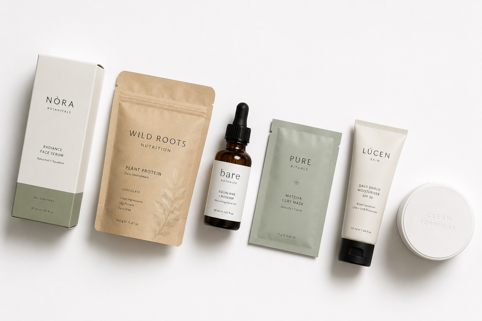
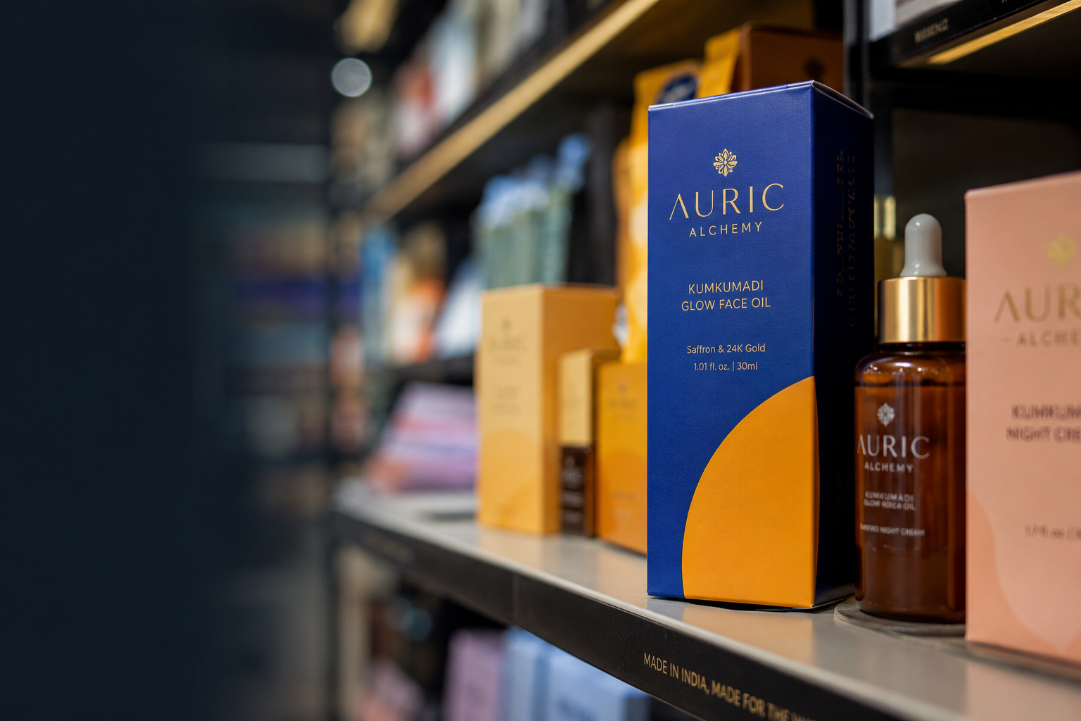
Mistake 4: Colour That Copies the Category Instead of Standing Apart From It
Founders in competitive categories often scan competitors, pick the dominant colour palette, and match it: calling this "meeting category expectations." What it actually does is make the product blend in completely.
In India's skincare D2C market, this has created a sea of white, pale blue, and beige across many brands. Each individual choice was logical, but collectively, the category became uniform: which means a new entrant with a distinctive palette, even a slightly unusual one, creates instant separation.
Some brands have leaned into muted, warmer tones: terracotta and forest greens, for instance: that feel premium without copying anyone else in the category. Others have gone the opposite direction entirely, using bright, high-contrast colours in a category where soft and natural is the norm, making the contrast itself part of the brand's personality.
The fix: Before picking a colour palette, map your 5–8 closest competitors visually. Find the colour territory they all share, then find the space nobody's using. If that space fits your positioning, it's yours to claim.
Mistake 5: Typography That Looks Good at Full Size but Falls Apart Elsewhere
Indian D2C packaging often leans heavily on custom or decorative typography for the brand name, while under-investing in the everyday type that actually needs to communicate on shelf.
The result is a striking logo that turns into a blur at thumbnail size, paired with body text that was never properly set up for print and looks different across production runs.
A few practical rules help avoid this: reserve decorative or script fonts for secondary brand elements, not the product name, since scripts are hard to read at distance or small sizes. Keep all-caps text to three words or fewer: it's harder to read at speed, so it doesn't work well for longer claims or ingredient lists. And always check your type at actual print size before approving, since spacing that looks airy on screen can look very different once printed.
Some D2C brands run into this specifically with quick commerce: a typographic system that looks elegant in full-size photography can become illegible in a Blinkit thumbnail grid, right where the brand's main differentiator needs to be readable at a glance.
The fix: Choose your primary font for legibility at small sizes first, personality second. Let colour, illustration, or your logomark carry the personality instead. Your product name and category claim need to be readable everywhere, under any condition.
See font categories and size rules for D2C packaging in our guide to best fonts for packaging design.
Mistake 6: Skipping Compliance Until After the Design Is Done
This is technically a process issue, but it always ends up landing on the design. A founder briefs a designer, approves a beautiful concept, prints a test run: and only then discovers that the mandatory information required by law doesn't fit in the space that was designed for it.
The back panel of Indian packaging is closely regulated. Food and supplement products need specific font sizes, nutrition tables, and allergen information under FSSAI rules. There are also separate rules (sometimes called "legal metrology") that govern exactly how weight or volume must be declared on the pack. Cosmetics sold in India have their own labelling rules under the Drugs and Cosmetics Act.
Skipping this step until later usually leads to one of three outcomes: last-minute text cramming that wrecks the layout, a redesign cycle that pushes the launch back by 4–8 weeks, or printing packaging that simply can't be sold through regulated channels like BigBasket, large supermarkets, or pharmacies.
The fix: Get all compliance requirements in front of the designer before any concepts are made, not after they're approved. Building these requirements into the production template and layout from day one is what gets packaging through retail buyer review on the first try.
Mistake 7: A Logo, Not a Visual Identity System
Many Indian D2C brands launch with a logo and one main colour. That's a starting point, not a system: and it tends to break the moment the brand needs to grow.
This shows up in a few familiar ways: a new product variant looks different from the rest of the range, the packaging, website, and Instagram all use slightly different versions of the logo, and a new vendor handling one asset returns something that looks like it belongs to a different brand entirely.
A consistent visual identity system means every product in a range is recognisable as part of that brand, regardless of variant: and that consistency isn't accidental. It comes from having a documented system that every vendor and designer follows, rather than each person making their own call.
Without that system, growth tends to fragment the brand. Every new product, campaign, or marketing piece adds a little more inconsistency, and over time the brand can start to look amateur even when individual pieces look fine on their own.
The fix: Build the system before the product range grows. At minimum, that means a logo with clear usage rules, a primary and secondary colour palette with exact print colour codes, primary and secondary typefaces, and a defined illustration or photography style. Everything else gets built on top of this.
A fragmented visual identity is one of the costliest mistakes Indian D2C founders make: see the full list in our piece on branding mistakes D2C startups make.
Mistake 8: Treating Packaging as a One-Time Decision
Founders who've been through one packaging cycle often consider it done. It isn't. Packaging needs to evolve as pricing changes, the product range grows, retail channels shift, and consumer expectations move on.
A few signs it's time for a revisit: the brand has moved to a higher price point but the packaging still looks entry-level, new variants have been added by different vendors with no shared reference and now look inconsistent, the original packaging was built for online but the brand is now entering physical retail where the shelf context is completely different, the category has visibly moved on and the brand now looks dated next to newer competitors, or retail buyers have started giving feedback that "the packaging needs work."
A useful real-world pattern: as a category matures and "does it work" becomes more important to shoppers than "is it natural," brands that started with softer, nature-led packaging often shift toward a cleaner, more clinical look to match that shift in what customers care about.
The fix: Schedule a packaging audit every 12–18 months. Check for consistency across variants, whether the positioning still fits the category, whether the pack still works for your current sales channels, and whether anything has changed on the compliance side.
If your packaging needs a strategic update rather than a full rebuild, see how a packaging redesign agency approaches an existing brand before recommending changes.
Packaging Design Checklist: Quick Self-Audit
Run your current packaging through this yes/no checklist before your next production run.
Hierarchy and legibility
- Can you read the product name at 200px wide (thumbnail scale)?
- Is there one clear focal point in Zone A of the front panel?
- Is the primary claim visible from 1 metre away?
Colour and differentiation
- Does your colour palette look different from your 5 closest competitors?
- Does your dominant colour match your positioning (premium, natural, clinical, energetic)?
Typography
- Is your primary typeface legible at small sizes and at print scale?
- Are you using fewer than three fonts on the front panel?
Compliance
- Have you checked that all mandatory information fits within the label area?
- Has someone reviewed your weight and volume declarations against current rules?
System consistency
- Do all your product variants look like they belong to the same brand?
- Is there a written brand system document a new vendor could follow?
Brief quality
- Was the packaging designed against a written brief covering channel, positioning, and compliance?
For the complete step-by-step version of this audit with specific action points, see our packaging design checklist for startups.