.png)




D2C Branding Trends in India That Are Shaping 2026
The brands growing fastest in Indian D2C right now aren't the ones with the prettiest packaging: they're the ones whose branding is doing real work: earning a pick-up on shelf, getting a click on a Blinkit thumbnail, and bringing customers back without needing a discount every time.
As customer acquisition costs keep rising across categories, founders who built their early growth on product quality alone are starting to hit a ceiling. The ones pushing past it tend to share one thing: a brand that earns attention before a customer reads a single word.
Here are six branding trends shaping Indian D2C in 2026, and what each one means for your brand.
Trend 1: Ingredient-Led, Science-First Branding
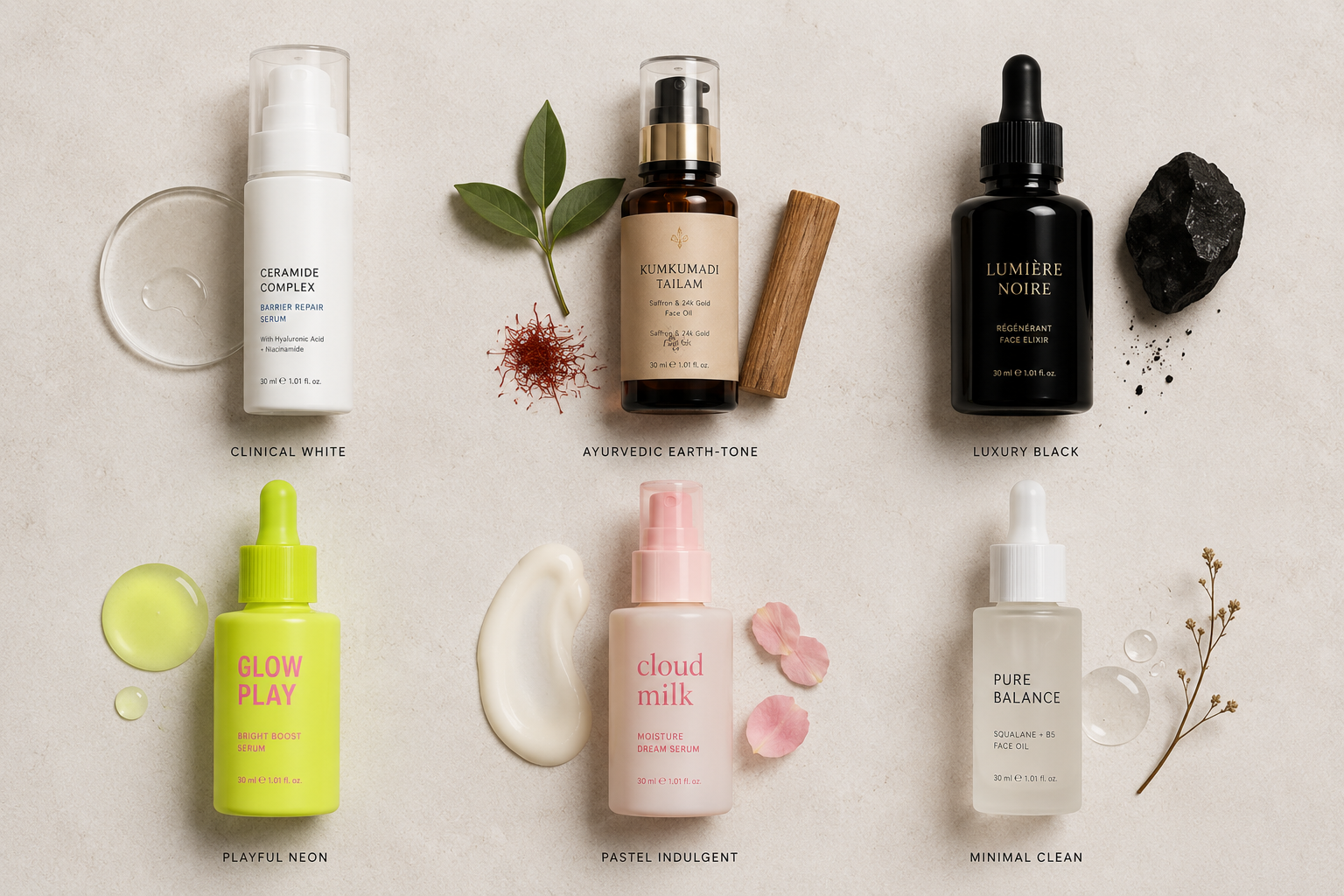
In skincare and wellness, the biggest shift is away from "natural" visual codes and toward clinical credibility. Beige tones, leaf prints, and hand-lettered fonts have become the default look for almost every brand on the shelf: which means they no longer help anyone stand out.
What's replacing this: tighter sans-serif typography, ingredient names and percentages used as headline design elements rather than small print, and more restrained colour systems with more whitespace.
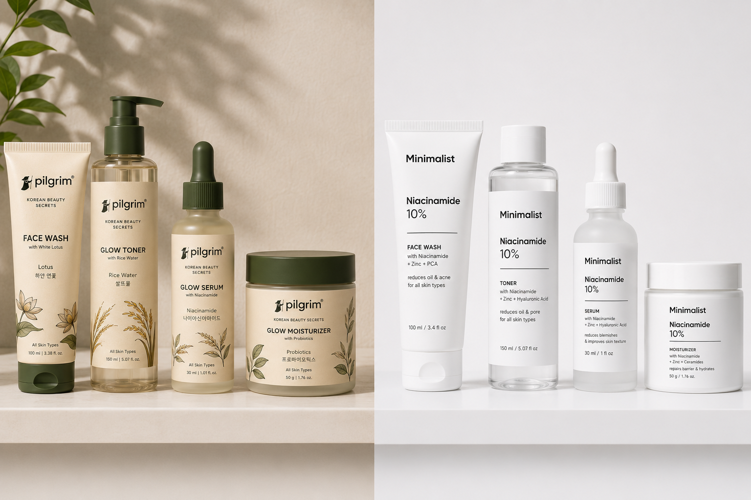
For Example: Minimalist is the clearest example. Its packaging looks closer to a European dermatology brand than a typical Indian skincare product: no illustrations, no lifestyle photography, just "Niacinamide 10%" front and centre on every SKU. Against competitors using colourful, lifestyle-led packaging, that restraint became the differentiator.
Pilgrim took a related but different approach, blending Korean skincare visual cues with Indian sensibilities: landing somewhere between clinical and warm, which let it appeal to buyers who want both efficacy and a sense of ritual.
What to do next: If your category still leans heavily on natural/organic visual codes, a more clinical, restrained look may be your open space. Look at your shelf set and ask honestly:
- Is the primary claim visible from 1 metre away?
- Does your colour palette look different from your 5 closest competitors?Does your dominant colour match your positioning (premium, natural, clinical, energetic)?
- Do all your product variants look like they belong to the same brand?
Use our packaging audit checklist to assess whether your current design is helping or hurting conversions.
Trend 2: Packaging Designed for the Thumbnail, Not Just the Shelf
What's happening: Quick commerce marketplaces like Blinkit, Zepto, and Swiggy Instamart now matter for a large share of Indian D2C brands in personal care, wellness, food, and household products. On these platforms, your product shows up as a thumbnail roughly 100 pixels wide. Most packaging was never designed with that in mind.
What works at thumbnail size:
- Strong contrast between background and brand name
- One dominant visual element (a single ingredient graphic, an icon, or a colour block)
- A brand name that's readable without zooming in
For Example: MCaffeine is a useful reference here: its neon accent colours, bold single-ingredient naming, and dark backgrounds work at thumbnail size, on shelf, and in ads, without the system changing between formats.
Compare that to a brand with a dozen SKUs that each use a different colour story: shoppers lose the thread exactly when the platform needs them to recognise and click.
.png)
What to do next: Open your product on Blinkit or Zepto right now, on your phone, without zooming in. If you can't read your brand name and main claim, that's costing you clicks and worth fixing before your next packaging refresh, not after.
See our blog on how packaging impacts ecommerce conversions to understand why thumbnail-level legibility on quick commerce apps directly affects click-through rates, and what design choices make the biggest difference.
Trend 3: From Logos to Full Brand Systems
What's happening: "Just get a logo done" no longer works for D2C founders building beyond a single hero product. What's replacing it is the brand system: a connected kit that covers everything your brand needs to look consistent across every surface.
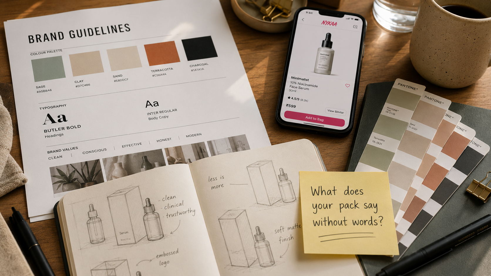
A proper brand system includes:
- Your logo and its variations (horizontal, stacked, icon-only)
- A colour palette with HEX, Pantone, and CMYK values
- Typography for headlines and body text
- Layout rules for different SKU sizes
- A defined tone of voice
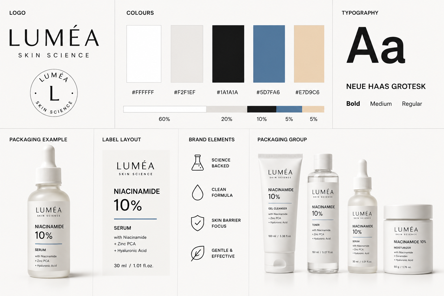
Why this matters: When a buyer at a modern trade chain or a marketplace like Nykaa or BigBasket looks at your brand, they check for consistency across your product range, your pitch deck, and your social presence. If every SKU looks like it came from a different studio, that reads as a brand still figuring itself out.
For Example: Sugar Cosmetics does this well at scale. Across 200+ SKUs, every product feels part of the same family while still standing apart within its own sub-range. That's not the result of a one-off logo project. It's a system applied consistently.
This applies across categories. Whether you're building a clean food brand or a supplement line, consistency is what makes a buyer trust you have staying power.
See our blog on the difference between branding and packaging to understand why a logo alone isn't a brand system, and what a complete identity kit needs to cover across every touchpoint.
Trend 4: Honesty as the Main Visual Message
Indian consumers: particularly those in their late twenties to late thirties buying wellness, clean food, and skincare: have become noticeably more label-literate. They read ingredient lists, check claims against what they already know, and tend to be sceptical of vague benefit language like "transforms your skin."
Brands responding to this are putting their full ingredient list front and centre, dropping unsupported before/after claims, leading with "what's in this and what it does" rather than a promise, and treating certifications (vegan, cruelty-free, FSSAI-compliant) as part of the design rather than small-print additions.
The Whole Truth built its entire identity around this: every label lists exactly what's in the bar, in plain English, in large type, with no benefit claims or lifestyle imagery at all. That transparency became the brand's main pitch, and it built a loyal following among people who'd stopped trusting vaguer claims elsewhere on the shelf.
What to do next: You don't need to go as far as The Whole Truth, but if your ingredient list is in 6-point font while your front of pack leads with "boosts energy naturally," that's worth revisiting. Try leading your next label redesign with your ingredient list or a specific claim, and see how it compares to your current version in a quick side-by-side test with a few customers.
Trend 5: Packaging as the Premium Signal
What's happening: Across clean food, supplements, personal care, and household products, categories that used to compete mainly on price are being repositioned as premium. Packaging is often the main signal that makes this work. Before anyone opens the product, the pack is what makes a higher price feel fair or like a risk.
In 2026, that premium signal tends to come from:
- Matte finishes over glossy ones
- Structured pack shapes with tactile difference
- Less visual clutter and more breathing room on the label
- Restrained foil or spot UV on a few key elements, not spread across the entire pack
.png)
The right price point for "premium" packaging varies by category and your specific ICP. A skincare product at INR 600 and a specialty food item at INR 350 both need packaging that justifies their respective price. The question isn't about hitting a specific number. It's whether your packaging looks like it belongs at your actual price point.
For Example: Mamaearth's packaging evolution is a useful reference. Early products used the natural green-and-cream look shared by most competitors. By 2022-23, the brand had shifted to a cleaner, cooler palette with tighter typography and reduced illustration. The product didn't change. The packaging moved the brand closer to a clinical, efficacy-led positioning without losing its original audience. That's premiumisation done well.
What to do next: If your packaging looks like it belongs in a lower price bracket than what you're charging, that's creating resistance before anyone reads a review. The fix usually isn't spending more on printing. It's removing visual noise and giving the design room to breathe.
See our blog on how premium packaging increases product value to understand which design choices and finishes help a brand justify a higher price.
Trend 6: One Brand, Every Channel
A D2C brand today exists across at least five places at once: physical packaging, an Amazon listing, a Blinkit thumbnail, an Instagram feed, and its own website. Many Indian D2C brands end up looking like five different brands across these: and the ones converting best look like one brand everywhere.
This means using a single defined colour system across packaging, web, and social; product photography that matches the packaging aesthetic rather than a separate "social" look and a separate "Amazon" look; the same typography across digital and print; and packaging photography that works equally well as a hero image and as a square Instagram tile.
What to do next: Open five tabs: your packaging, your Amazon listing, your Instagram profile, your website homepage, and your Blinkit listing: side by side. If they don't tell the same visual story, every channel is working a little against the others. This usually doesn't need a full rebrand to fix; it needs your existing brand system applied consistently across all five, starting with whichever one feels most out of step.
What This Means for Your Brand
Across all six trends, the same idea keeps showing up in different forms: small design decisions: a colour choice, a typography system, a label hierarchy: tend to have direct, measurable effects on clicks, pick-ups, and repeat purchases.
A practical way to use this article: pick the one trend above that feels most relevant to where your brand is right now, and make one concrete change this quarter: redesign your front-of-pack hierarchy, build out a proper brand system document, or test your packaging at thumbnail size before your next print run. Branding works best as an ongoing investment rather than a one-time project, and small, consistent improvements tend to compound.
If you'd like support figuring out where to start, Jellypop designs branding and packaging for Indian D2C founders, built for shelf, quick commerce, and digital from day one. Start a conversation at jellypop.design.